
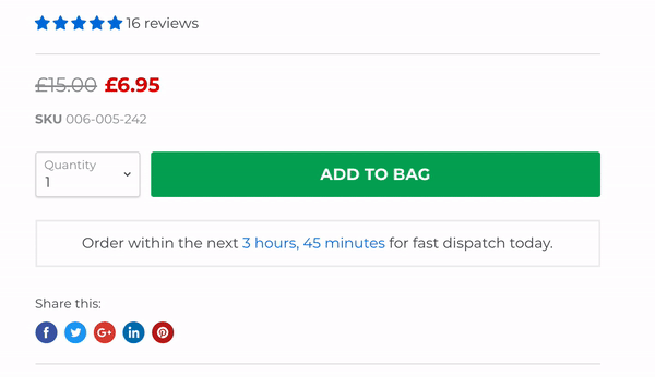
You can make your Shopify Add to Cart button shake for free with a few lines of CSS, or by using a no-code app if you would rather avoid editing theme files. In most stores, the fastest free method is custom CSS, and it usually takes under 5 minutes on a duplicate theme.
I've worked on Shopify stores for years and I build Shopify apps myself, so I have a fairly strong opinion on this one. A shaking Add to Cart button can improve visibility, but only when it is used with restraint. If the animation is too aggressive, too constant, or appears on every button across the site, it can feel cheap and hurt conversions instead of helping them.
That is why this guide covers the best free code method, the best no-code options, and the practical details most older tutorials skip, like Shopify 2.0 theme differences, accessibility, hover-only animation, and how to avoid making your product page look spammy.
If you are also working on broader conversion improvements, have a look at How to Maximize Revenue from Your Shopify Product Pages and How to Create Shopify Cart Drawer Upsells That Boost AOV. A button animation works best when the rest of the product page is already doing its job.
What is the easiest free way to make the Add to Cart button shake on Shopify?
The easiest free way is to add a CSS animation to your product form button. This works on most Shopify themes, including Dawn and other Online Store 2.0 themes, and does not require a paid app.
Right now, the search results are full of short videos showing either a simple CSS snippet or a no-code section app. Both approaches work, but in my experience building and testing Shopify storefronts, CSS is the most flexible option because you control the timing, intensity, trigger, and where the effect appears.
Should you make your Add to Cart button shake at all?
Yes, but only if you do it carefully. The goal is to draw attention to the primary call to action, not to turn the product page into a flashing banner ad.
Most Shopify stores convert somewhere around the low single digits, and even small UX improvements can matter. But animation is not a magic trick. In my experience, a shake effect works best when your store already has strong product imagery, clear pricing, trust signals, and a visible Add to Cart button above the fold.
If your product page is weak, animation will not fix it. If your page is already solid, a subtle shake can help users notice the next step. That is the difference.
What are the best free ways to make the Add to Cart button shake on Shopify?
The best free options are custom CSS, Section Store, and Rombo. CSS is best for control, Section Store is best for zero-code Shopify 2.0 setups, and Rombo is best if you want app-based animation rules.
Here is the quick comparison I would use if I were setting this up on a client store today.
| Method | Cost | Setup time | Coding needed | Best for | Verdict |
|---|---|---|---|---|---|
| Custom CSS | Free | Under 5 minutes | Minimal | Any theme, full control | Best overall |
| Section Store | Free section available | Under 5 minutes | None | Shopify 2.0 users who want no code | Best no-code option |
| Rombo | Free plan available | 5-10 minutes | None | Animation rules across multiple elements | Good if you want app control |
I would avoid paying for a dedicated shake-button app unless you have a very specific reason. For most stores, paid apps are unnecessary here because the effect is simple and easy to reproduce with CSS.
How do I make the Add to Cart button shake on Shopify with CSS for free?
You can do this by adding a CSS animation to your theme stylesheet, then targeting the Add to Cart button. This is the most reliable free method and works on both free and premium Shopify themes.
Before you change anything, make a backup of your theme. In Shopify admin, go to Online Store > Themes, click the three dots, and choose Duplicate. I still do this on every store, even for tiny edits, because it only takes a few seconds and saves a lot of stress.
Step 1: Open your theme code or custom CSS area
On Shopify 2.0 themes, you can often use the built-in custom CSS area. On older themes, you will usually edit a CSS file like base.css, theme.css, or theme.scss.liquid.
- Go to Online Store > Themes
- Click Customize and check whether your theme has a Custom CSS field in theme settings
- If not, go back and click Edit code
- Open your main stylesheet, usually under Assets
For most modern themes, assets/base.css is the right place. For older themes, it might be something else, but the principle is the same.
Step 2: Paste in the shake animation CSS
The CSS below adds a subtle side-to-side shake. I recommend starting with a restrained version first. Subtle usually converts better than dramatic.
button[name="add"] {
  animation: shopifyShake 4s infinite;
  transform-origin: center;
}

@keyframes shopifyShake {
  0% { transform: translateX(0); }
  1% { transform: translateX(-2px); }
  2% { transform: translateX(2px); }
  3% { transform: translateX(-2px); }
  4% { transform: translateX(2px); }
  5% { transform: translateX(0); }
  100% { transform: translateX(0); }
}

@media (prefers-reduced-motion: reduce) {
  button[name="add"] {
    animation: none;
  }
}
This version shakes briefly, then stays still. That matters. Constant movement is distracting, and it can also create accessibility issues for some users.
If your theme does not use button[name="add"], you may need to target a different selector. Common alternatives include .product-form__submit, .add-to-cart, or a theme-specific button class.
Step 3: Save and preview the product page
Once you save the CSS, preview your product page and check whether the button animates. If nothing happens, the most likely problem is the selector, not the animation itself.
In Dawn, for example, the Add to Cart button often uses classes like .product-form__submit. If the generic selector does not work, try this version instead:
.product-form__submit {
  animation: shopifyShake 4s infinite;
  transform-origin: center;
}

@keyframes shopifyShake {
  0% { transform: translateX(0); }
  1% { transform: translateX(-2px); }
  2% { transform: translateX(2px); }
  3% { transform: translateX(-2px); }
  4% { transform: translateX(2px); }
  5% { transform: translateX(0); }
  100% { transform: translateX(0); }
}
Step 4: Use hover-only animation if you want a cleaner effect
Hover-only shake is often the better choice on desktop. It feels more intentional and avoids constant motion while still adding interactivity.
button[name="add"]:hover,
.product-form__submit:hover {
  animation: hoverShake 0.4s ease-in-out;
}

@keyframes hoverShake {
  0% { transform: translateX(0); }
  25% { transform: translateX(-3px); }
  50% { transform: translateX(3px); }
  75% { transform: translateX(-3px); }
  100% { transform: translateX(0); }
}
I like this approach for brands that want a more premium feel. It is also closer to what some of the newer video tutorials are showing in the current results.
How do I add the shake class manually in Shopify theme code?
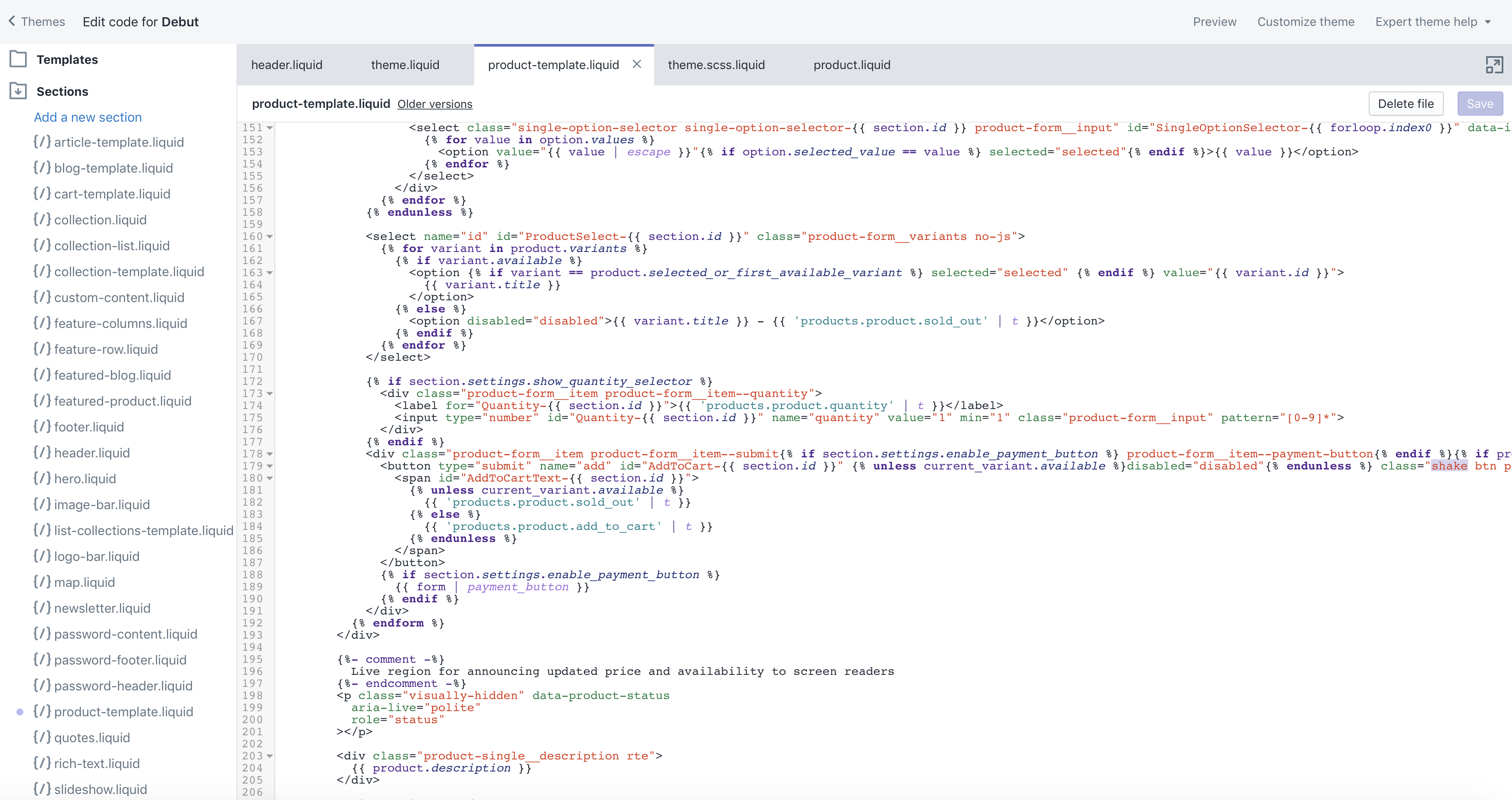
You can also add a custom class like shake directly to the Add to Cart button in your Liquid template. This is useful if you want to target one specific button only instead of every add-to-cart button on the site.
This is the method from the original version of this article, and it is still relevant. The only thing that has changed is that Shopify 2.0 themes structure files a bit differently.
- Go to Online Store > Themes > Edit code
- Find your product form file, often sections/main-product.liquid on Shopify 2.0 themes
- Locate the Add to Cart button markup
- Add a class such as shake to the button element
It might look something like this:
<button type="submit" name="add" class="product-form__submit shake">
  Add to cart
</button>
Then add this CSS to your stylesheet:
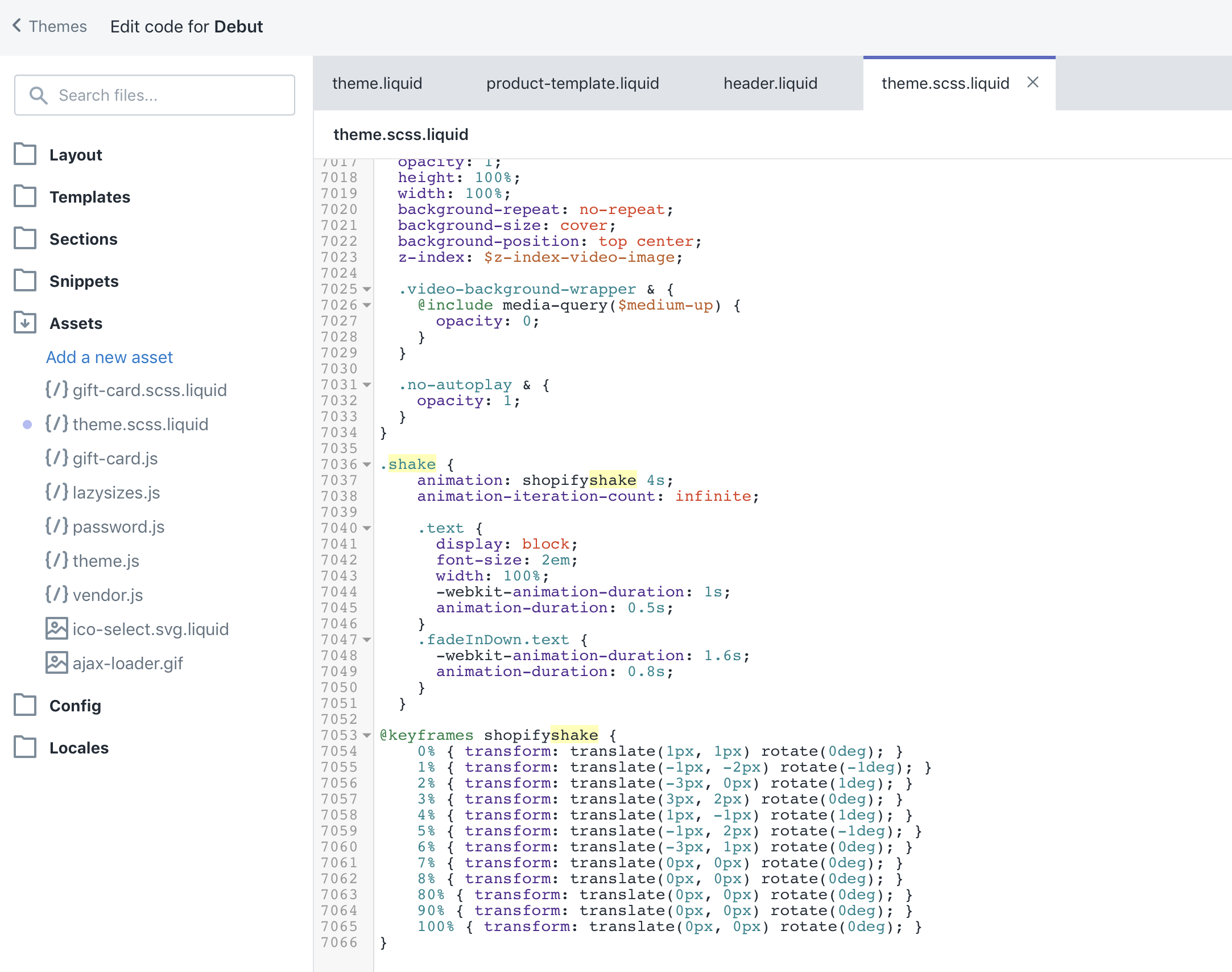
.shake {
  animation: shopifyshake 4s infinite;
}

@keyframes shopifyshake {
  0% { transform: translate(1px, 1px) rotate(0deg); }
  1% { transform: translate(-1px, -2px) rotate(-1deg); }
  2% { transform: translate(-3px, 0px) rotate(1deg); }
  3% { transform: translate(3px, 2px) rotate(0deg); }
  4% { transform: translate(1px, -1px) rotate(1deg); }
  5% { transform: translate(-1px, 2px) rotate(-1deg); }
  6% { transform: translate(-3px, 1px) rotate(0deg); }
  7% { transform: translate(0, 0) rotate(0deg); }
  100% { transform: translate(0, 0) rotate(0deg); }
}
This older jiggle style still works well. I would just tone it down slightly for most modern stores.
How do I make the Add to Cart button shake without code?
You can do it without code by using a Shopify app or section tool. The two most practical free options right now are Section Store and Rombo.
I generally prefer code for something this simple, but if you are not comfortable editing theme files, no-code is perfectly reasonable.
Is Section Store the best no-code option?
Section Store is one of the best no-code options if you are on a Shopify 2.0 theme and want a prebuilt animated Add to Cart section. It is quick, visual, and beginner-friendly.
The current ranking videos mention it a lot for a reason. You install the app, choose the relevant Add to Cart section, then customise it inside the theme editor. If you want a fast result without touching CSS, this is probably the easiest route.
- Install Section Store
- Open the app and look for the free Add to Cart section
- Add it to your product template
- Choose the shake style, such as jiggle or side-to-side
- Save and test on mobile and desktop
For merchants who want to avoid code completely, this is the most competitive no-code answer in the SERPs right now.
Is Rombo worth using on the free plan?
Rombo is worth considering if you want to animate more than just the Add to Cart button. The free plan is limited, but it can be enough for a small store testing a few effects.
I would use Rombo if you want a dashboard for animations and prefer app controls over CSS. I would not use it if all you need is one subtle shake effect on one button, because custom CSS is cleaner and lighter.
What is the best CSS selector for the Shopify Add to Cart button?
The best selector depends on your theme. On many Shopify themes, button[name="add"] works well, while on Dawn and similar themes, .product-form__submit is often more reliable.
This is where many tutorials fall short. They give you code, but not the reason it sometimes fails. In my experience, the animation almost always works. The issue is usually that the CSS is targeting the wrong element.
| Theme type | Common selector | Notes |
|---|---|---|
| Shopify 2.0 themes like Dawn | .product-form__submit |
Most reliable starting point |
| General Shopify themes | button[name="add"] |
Works if the button uses the standard product form name |
| Older custom themes |
.add-to-cart or theme-specific class |
Inspect the button if the standard selectors fail |
If you are unsure, right click the button in your browser, choose Inspect, and look at the class names on the button element. Shopify also has relevant developer documentation at Shopify.dev if you want to understand the theme structure better.
How can I make the shake effect look better and convert better?
The best-performing shake effects are usually subtle, occasional, and limited to the main CTA. That is the short answer.
When I test this kind of effect, I try to avoid three common mistakes: making it too fast, making it run forever with no pause, and applying it to both Add to Cart and every other button on the page. That usually creates visual noise rather than focus.
- Use a pause between shakes so the button is not constantly moving
- Keep the movement small at 2px to 5px rather than 10px+
- Test hover-only on desktop for a cleaner brand feel
- Leave mobile calmer if your page already feels busy
- Do not animate disabled buttons when variants are unavailable
If you are also experimenting with upsells and product page improvements, these guides will help you think more holistically: How to Upsell on Shopify in 2026, How to upsell on Shopify leveraging AI, and AI-powered upsells: the future of ecommerce conversion.
Will a shaking Add to Cart button hurt accessibility or site speed?
It can affect accessibility if you do it badly, but a lightweight CSS animation has almost no speed impact. The bigger concern is motion sensitivity and usability, not performance.
That is why I strongly recommend using the prefers-reduced-motion media query in your CSS. It respects users who have told their device they prefer less animation. This is a small detail, but it is the sort of thing that separates a quick hack from a professional implementation.
If accessibility is on your radar, read Website Accessibility Lawsuits: What Every Shopify Merchant Needs to Know in 2025. Animation choices are only one small piece of the puzzle, but they do matter.
What if the Add to Cart button shake is not working?
If the effect is not working, the most common causes are the wrong CSS selector, the CSS being added to the wrong file, or theme caching and preview confusion.
Here is the troubleshooting checklist I use.
- Confirm the selector by inspecting the button in your browser
- Check the CSS file is actually loaded by the theme
- Make sure you saved the file and refreshed the preview
- Test on a product page, not just the homepage or collection page
- Check if another CSS rule overrides transform or animation
- Verify the button is not being replaced by an app block
If a theme or app injects its own product form, you may need to target a different element. This is especially common on stores using subscription widgets, sticky add-to-cart bars, or custom product options.
Should you use CSS or an app for this in 2025 and 2026?
For most merchants, CSS is still the best choice in 2025 and going into 2026. It is free, fast, lightweight, and easy to remove if you change your mind.
I would only recommend an app if you want broader animation controls, visual editing, or a prebuilt section that fits your theme better than the native product form. Otherwise, adding an app for one small effect is overkill.
This is a good general rule for Shopify customisation too. If a change can be done with 10 lines of CSS instead of another app install, I usually choose CSS. Fewer apps often means fewer conflicts, fewer scripts, and less maintenance.
If you are trying to keep your store lean, you might also want to read The Hidden Truth About Shopify Speed Optimization Scams. It is not directly about button animations, but it is very relevant when merchants start stacking apps for tiny visual tweaks.
What is my recommended setup for most Shopify stores?
My recommended setup is a subtle CSS shake on the main product page Add to Cart button only, with a pause between animations and reduced motion support. That gives you the attention boost without making the page feel frantic.
If you are a beginner and do not want to touch code, use Section Store. If you are comfortable editing CSS, use the custom code method in this article. If you want broader visual animation controls, test Rombo.
And one final point from experience: test the effect on a real product page with real traffic. Do not assume more movement means more sales. Sometimes the best version is the one that barely moves at all.
How do I make the Add to Cart button shake on Shopify for free in the quickest possible way?
The quickest method is to paste a CSS snippet into your theme stylesheet and target button[name="add"] or .product-form__submit. For most stores, that is the fastest, cheapest, and cleanest answer.
If you want the shortest possible version, use this:
.product-form__submit {
  animation: shopifyShake 4s infinite;
}

@keyframes shopifyShake {
  0%, 95%, 100% { transform: translateX(0); }
  96% { transform: translateX(-3px); }
  97% { transform: translateX(3px); }
  98% { transform: translateX(-3px); }
  99% { transform: translateX(0); }
}

@media (prefers-reduced-motion: reduce) {
  .product-form__submit {
    animation: none;
  }
}
Paste that into your theme CSS, save, preview your product page, and you are done.
If you want to keep improving your conversion setup after this, I would next focus on cross-sells, subscription upsells, and making sure your store is ready for AI search engines too.