
Shopify product page optimisation is one of the fastest ways to grow revenue without buying more traffic. In my experience building Shopify apps and analysing merchant stores, the biggest gains usually come from improving the pages that already get visits, not endlessly tweaking the homepage.
A strong product page does two jobs at once: it increases conversion rate and it raises average order value. That means better visuals, clearer messaging, stronger trust signals, smarter mobile UX, and relevant upsells that feel helpful rather than pushy.
If you want a broader framework for improving conversion across your store, I’d also read How to Optimize Your Conversion Rate on Shopify: 2026 Guide. But in this article, I’m focusing specifically on the product detail page, because that is where purchase intent is highest and where small changes can produce outsized revenue gains.
Why should you focus on Shopify product page optimisation first?
Your product pages are the most important revenue pages on your store. They are where shoppers decide whether to buy now, compare alternatives, or leave.
That is why product page optimisation consistently outperforms broad redesign projects. Instead of changing everything at once, you improve the exact page elements that affect buying confidence: images, copy, pricing clarity, reviews, mobile usability, and upsells.
Current research backs this up. 67% of consumers prioritise image quality when deciding whether to buy online. Product videos have also become a major lever, with data showing 88% of tested stores saw conversion lifts and some merchants reporting 68% AOV growth after adding effective product video content.
There is also the simple reality of ecommerce maths. If your PDP conversion rate rises from 2% to 2.6% and your average order value rises from £52 to £59, you have created a meaningful revenue increase without increasing ad spend. That is exactly why I tell merchants to treat PDPs as profit centres, not just catalogue pages.
What makes a high-converting Shopify product page in 2026?
A high-converting Shopify product page reduces hesitation. It answers the customer’s questions quickly, makes the next step obvious, and gives them a reason to add more to their basket.
In practice, the best-performing product pages usually include these essentials:
- Clear product title with the main benefit or differentiator
- High-quality images from multiple angles
- Short-form and detailed descriptions for both quick scanners and careful buyers
- Visible price, shipping, and returns information
- Prominent Add to Cart button above the fold on mobile and desktop
- Reviews and social proof near the CTA
- Relevant upsells, bundles, or add-ons
- Fast loading speed and clean mobile UX
When I review stores, I often find that merchants already have decent products and decent traffic. What they lack is a page structure that makes buying feel easy. That gap is where most revenue opportunities sit.
How do I write product titles and descriptions that increase revenue?
The best product titles and descriptions make the value obvious fast. They should help shoppers understand what the product is, who it is for, and why it is worth the price.
A weak title says what the item is. A strong title says what it is and adds context. For example, instead of “Leather Wallet”, a stronger version might include material, format, or audience. This improves both SEO relevance and purchase clarity.
Your description should not be one giant block of text. I recommend structuring it in layers:
- A short benefit-led intro near the top
- Bullet points covering key features and use cases
- Specifications such as size, materials, compatibility, or care instructions
- Objection-handling details like fit guidance, shipping, warranty, or returns
In my experience, missing practical details cause more lost sales than weak branding does. Customers abandon product pages because they cannot confirm fit, finish, dimensions, compatibility, or delivery timing. If you sell technical or high-consideration products, adding comparison charts and buying guides can have a huge impact.
If you are working on product-page messaging more broadly, you may find Enhancing Your Shopify Product Page Conversion Rate: 6 Effective Strategies useful too.
How important are images and videos on Shopify product pages?
Images and videos are often the biggest conversion lever on a product page. Shoppers cannot touch your product, so your visuals have to do the selling.
The baseline in 2026 is no longer one clean studio image and a hope for the best. You need multiple angles, zoomable detail shots, and ideally lifestyle imagery that shows scale and real-world use. For premium products, variant-specific images and close-ups are especially important because they reduce uncertainty.
Here is what I usually recommend merchants include:
- 5-8 product images as a sensible starting point
- At least one close-up detail image
- At least one in-use or lifestyle image
- Variant-linked media so selecting a colour or style updates the gallery
- A short product demonstration video
Video is especially effective for products where movement, texture, scale, or setup matters. That includes apparel, beauty, furniture, electronics, fitness products, and anything with features that are easier to show than explain. Even a simple 15 to 30 second demo can improve understanding and increase confidence.
If you sell high-ticket products, you can go further with 360-degree views or AR models. Those features are not essential for every store, but they can be worth testing for furniture, homeware, jewellery, and technical products.
How should a Shopify product page be laid out for mobile?
Your mobile layout should make buying frictionless. The product name, price, variant selector, and Add to Cart button should be easy to find without excessive scrolling.
Mobile is where many product pages underperform. Merchants often design for desktop first, then discover that the mobile page pushes the CTA too far down, hides key details in tabs, or loads too slowly. Since a large share of Shopify traffic is mobile, this is one of the first areas I check.
These are the mobile fixes that usually matter most:
- Keep the primary CTA above the fold where possible
- Use a sticky Add to Cart bar on long pages
- Make variant pickers thumb-friendly
- Show price, sale price, and payment options clearly
- Do not bury shipping and returns too deeply
- Compress media and use modern formats like WebP where possible
Page speed matters here too. Slow product pages hurt UX, increase bounce, and can reduce ad efficiency. If your page is packed with apps, oversized images, and third-party scripts, your conversion rate may be paying the price.
How do reviews and trust signals increase product page revenue?
Trust signals reduce purchase anxiety. Reviews, guarantees, delivery clarity, and transparent returns policies help shoppers feel safe enough to buy.
In most niches, customers are not just asking “Do I want this?” They are also asking “Can I trust this store?” and “Will this product match what I expect?” Good product pages answer both questions before the shopper has to ask.
The most effective trust elements usually include:
- Star ratings and review counts near the product title or CTA
- Photo reviews or UGC where available
- Delivery estimates and fulfilment clarity
- Returns and guarantee messaging
- Secure checkout indicators and accepted payment methods
As a Shopify app developer, I have seen stores overdo fake urgency and underdo genuine reassurance. “Only 2 left” is not helpful if the rest of the page feels thin or vague. Start with trust, then layer in urgency carefully.
If you want to improve customer confidence and order value at the same time, pairing reviews with relevant offers works well. That is one reason upsells on the product page can perform so strongly when they are positioned as useful additions rather than sales tricks.
What is the best way to increase AOV from a Shopify product page?
The best way to increase AOV on a product page is to offer relevant add-ons or complementary products before the customer reaches the cart. Product-page upsells work because intent is high and context is clear.
Common examples include protection plans, accessories, refill packs, gift wrap, matching items, or upgraded versions. The key is relevance. A good upsell feels like it completes the purchase. A bad one feels random.
I usually recommend one of these product-page revenue plays:
- Add-on offers such as gift wrap, warranties, or premium packaging
- Frequently bought together bundles
- Cross-sells for matching or compatible products
- Upgrade offers for larger sizes, better materials, or subscription options
If you want more ideas on offer types and placement, see Shopify Upsell on the Product Page: Best Methods, Apps and Setup Tips for 2026 and How to Upsell on Your Shopify Store: 6 Methods. I also covered matching-item tactics in How to Cross-Sell Matching Variants and Boost Your Shopify Store’s AOV in 2025.
Should you code product page upsells yourself?
You can code upsells yourself, but it is rarely the best use of time for most merchants. Custom builds offer flexibility, but they also create maintenance work, testing overhead, and theme compatibility risks.
The original version of this article showed a simple code approach, and technically that is still possible. But in 2026, most merchants are better served by tools that handle display logic, analytics, targeting, and design controls without touching theme files.
From what I have seen, custom-coded upsells usually run into the same problems:
- Technical setup and ongoing maintenance
- Theme update conflicts
- Limited reporting on impressions, take rate, and revenue
- Longer testing cycles when you want to change copy, products, or placement
What is the no-code option for product page upsells?
A no-code upsell app is the fastest way to launch, test, and optimise product-page offers. It gives you more flexibility than hard-coded logic and usually much better reporting.
Since I build Shopify apps myself, I care a lot about whether an app solves a real merchant problem or just adds clutter. For product-page upsells, SellUp is designed to make offer creation quick, measurable, and easy to maintain.
![]()
SellUp lets merchants create on-page offers without custom development. That matters because speed of iteration is often more valuable than perfect customisation.
- One-click installation
- No-code offer setup
- Flexible product recommendations
- Theme-friendly display
- Built-in analytics to track performance
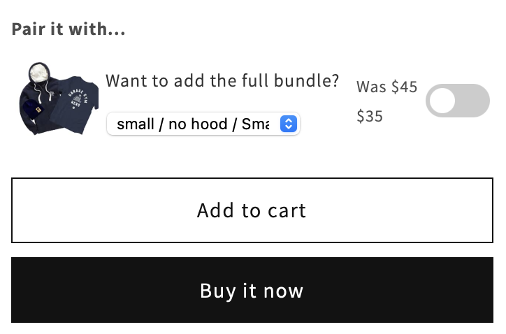
Getting started is straightforward. Install SellUp from the Shopify App Store, choose the products you want to attach offers to, then select complementary items or add-ons that fit naturally with the main purchase. From there, you can customise the wording and styling to match your brand.
One detail I like is that the offer format feels lightweight. It does not need to hijack the page or interrupt the path to checkout. In many stores, a simple toggle or clean add-on module converts better than an aggressive pop-up because it feels like part of the product selection flow.
For merchants who want to understand setup options in more detail, there is also documentation on SellUp’s on-page offers.
What apps can help improve Shopify product page revenue?
The best apps depend on the bottleneck on your product page. Some stores need better upsells, some need stronger visuals, and some simply need cleaner implementation.
Below is a practical comparison of the app options directly relevant to this article and workflow.
| App | Best for | Main use case | My view |
|---|---|---|---|
| SellUp | Product-page upsells | Add-ons, cross-sells, on-page offers | Best for increasing AOV quickly without custom code |
| Shopify App Store | Finding tools | Browse apps by category | Useful starting point if you need to compare additional visual or CRO tools |
If you are browsing the wider ecosystem, the Shopify App Store is where you can compare solutions for reviews, sticky add to cart, image zoom, video, and merchandising. My advice is to avoid stacking too many apps at once. Every new app should justify its cost, script weight, and complexity.
How do I test Shopify product page changes properly?
The best way to test PDP changes is to measure one primary KPI at a time. In most cases, that KPI is conversion rate, with guardrails like AOV, refund rate, or return rate.
This is where many merchants go wrong. They change the gallery, description, CTA colour, reviews placement, and upsell module all in the same week, then have no idea what actually improved results. Clean testing beats busy testing.
My standard testing process looks like this:
- Pick a high-traffic product or collection of similar products
- Choose one primary KPI, usually product-page conversion rate
- Set guardrails such as AOV, returns, or bounce rate
- Test one meaningful change at a time
- Run the test long enough to avoid making decisions on noise
- Roll out winners gradually across similar products
For example, if you are adding video, do not also change your CTA placement and review widget at the same time. If you are testing upsells, keep the main product layout stable so you can attribute any AOV change properly.
In my experience, the fastest wins usually come from testing these in order:
- Images and video
- CTA visibility on mobile
- Review placement
- Shipping and returns clarity
- Relevant on-page upsells
What are the most common Shopify product page mistakes to avoid?
The most common mistakes are unclear messaging, weak visuals, hidden trust signals, and irrelevant upsells. Most underperforming product pages are not failing because of one dramatic flaw. They are failing because of several small friction points.
Here are the issues I see most often when reviewing stores:
- Only one or two product images
- No product video for items that clearly need one
- Add to Cart button too low on mobile
- Descriptions that talk about the brand more than the product
- No sizing, fit, material, or compatibility details
- Reviews hidden in tabs or shown too far down the page
- Upsells that are generic instead of product-specific
- Too many apps slowing down the page
A related mistake is trying to maximise revenue with pressure tactics alone. Urgency can help, but it cannot rescue a product page that does not answer basic buyer questions. Confidence first, persuasion second.
What is my recommended Shopify product page optimisation checklist?
If you want a practical starting point, optimise the essentials before chasing advanced tactics. Revenue usually improves fastest when you fix the basics in the right order.
Here is the checklist I would use if I were auditing a Shopify store today:
- Rewrite the title to be clearer and more benefit-led
- Improve the first three gallery images
- Add a short product video
- Bring price, variants, and Add to Cart above the fold
- Add or reposition reviews near the CTA
- Clarify shipping, delivery, and returns
- Expand practical product details like size, materials, and compatibility
- Add one relevant on-page upsell
- Check mobile speed and remove unnecessary scripts
- Test one change at a time and track results
If you want to go deeper on product-page structure, see Free Shopify Blueprint for Higher-Converting Product Detail Pages (PDP). And if your main goal is lifting revenue from existing traffic, How to Increase Shopify Sales Without Additional Products in 2026 is a strong next read.
How can you maximise revenue from your Shopify product pages starting today?
Start with the pages that already get traffic, then improve clarity, trust, and AOV in that order. You do not need a full redesign to get better results.
If I were prioritising actions this week, I would first upgrade visuals, then tighten the mobile layout, then add reviews and delivery reassurance near the CTA. After that, I would introduce a relevant product-page upsell using a tool like SellUp and measure the impact on conversion rate and AOV.
That is the real opportunity with Shopify product pages. They are not just there to describe products. They are there to sell confidently, reduce hesitation, and increase basket value at the exact moment a customer is most likely to buy.
In my experience building Shopify apps, the merchants who win are not always the ones with the prettiest themes. They are the ones who keep improving the buying experience with clear testing, strong fundamentals, and offers that genuinely help the customer make a better purchase.