Displaying product accessories on Shopify effectively means showing the right add-ons at the right moment, usually on the product page, cart, and collection pages, without making the buying journey feel cluttered. In my experience building Shopify apps for merchants, the stores that do this well usually see a higher average order value, better product discovery, and fewer missed cross-sell opportunities.
If you sell products that naturally pair with extras, such as cases, chargers, straps, refill packs, care kits, gift wrap, or matching variants, this is one of the easiest ways to improve conversion without increasing traffic. The best setup is usually a mix of product page add-ons, related product blocks, and simple bundles rather than one heavy-handed upsell tactic.
Recent ecommerce benchmarks and merchant case studies consistently show that well-placed cross-sells can lift order value by 10% to 30%. That lines up with what I have seen firsthand when testing upsell placements across Shopify stores and while building apps like SellUp for accessory and add-on offers.
Why is displaying product accessories on Shopify so important?
Displaying accessories matters because it helps customers complete their purchase instead of buying only the core item. It also increases visibility for products that often get buried in collections or site navigation.
A customer buying a camera may also need a memory card, bag, tripod, or lens cloth. A customer buying a sofa may want a fabric care kit. A customer buying jewellery may want a gift box, chain extender, or polishing cloth. If those accessories are not presented clearly at the point of decision, you are relying on shoppers to go and find them themselves, and most simply will not.
In my experience, accessory merchandising works best when it feels helpful rather than aggressive. The goal is not to interrupt the purchase. The goal is to answer the shopper's next question before they ask it: "What else do I need with this?"
How do accessories improve product visibility?
Accessories improve product visibility by placing smaller complementary products in front of buyers who already have purchase intent. This is much more effective than hoping shoppers browse to a separate accessories collection.
Accessories are often lower-priced items with lower standalone traffic. Put them next to a hero product, though, and they suddenly become relevant. That relevance is what drives clicks and add-to-cart actions.
Good visibility also improves perceived completeness. When shoppers see a polished "Complete the set" or "Frequently bought together" section, the store feels more intentional and easier to shop.
How do product accessories increase average order value?
Product accessories increase average order value by encouraging shoppers to add complementary items in the same session. This is one of the simplest forms of cross-selling on Shopify.
Research commonly cited across ecommerce studies suggests that product page cross-sells can increase order value by 10% to 30% when implemented well. I would not treat every stat online as universal, but the pattern is real: merchants who make add-ons easy to understand and easy to add usually outperform those who hide them in menus or unrelated collections.
If you want a broader strategy beyond accessories, I have covered this in how to maximise revenue from your Shopify product pages. Accessory placement is often one of the quickest wins because it supports the main purchase instead of competing with it.
What is the best way to display product accessories on Shopify?
The best way to display product accessories on Shopify is on the product page, close to the Add to Cart button, using a simple add-on block with images, prices, and one-click selection. For most stores, that is the highest-converting placement.
You can then reinforce that with a cart upsell and a curated related products section. In practice, I recommend starting with 3 to 5 accessories max per product. More than that usually hurts clarity, especially on mobile.
How do I show product accessories as add-ons?
The easiest way to show accessories as add-ons is to place them directly on the product page with checkboxes, thumbnails, pricing, and a one-click add-to-cart flow. This keeps the shopper focused and reduces friction.
For many merchants, an app is the fastest route. I am obviously close to this category because I build Shopify apps myself, but that also means I have seen where merchants get stuck. Most stores do not need custom Liquid for a standard accessory setup. An app handles the heavy lifting for the majority of use cases.
![]()
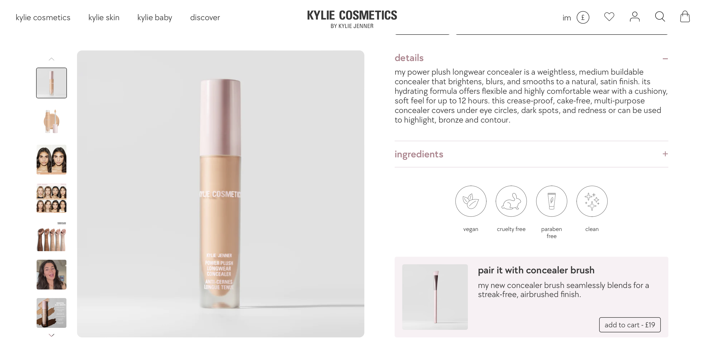
SellUp is one option for showing complementary products as offers on product pages and in-cart. It works especially well when you want a clean upsell block that feels native to the buying flow. I have seen merchants use it to present accessories like cases, gift wrap, replacement parts, and matching products without sending users away from the page.
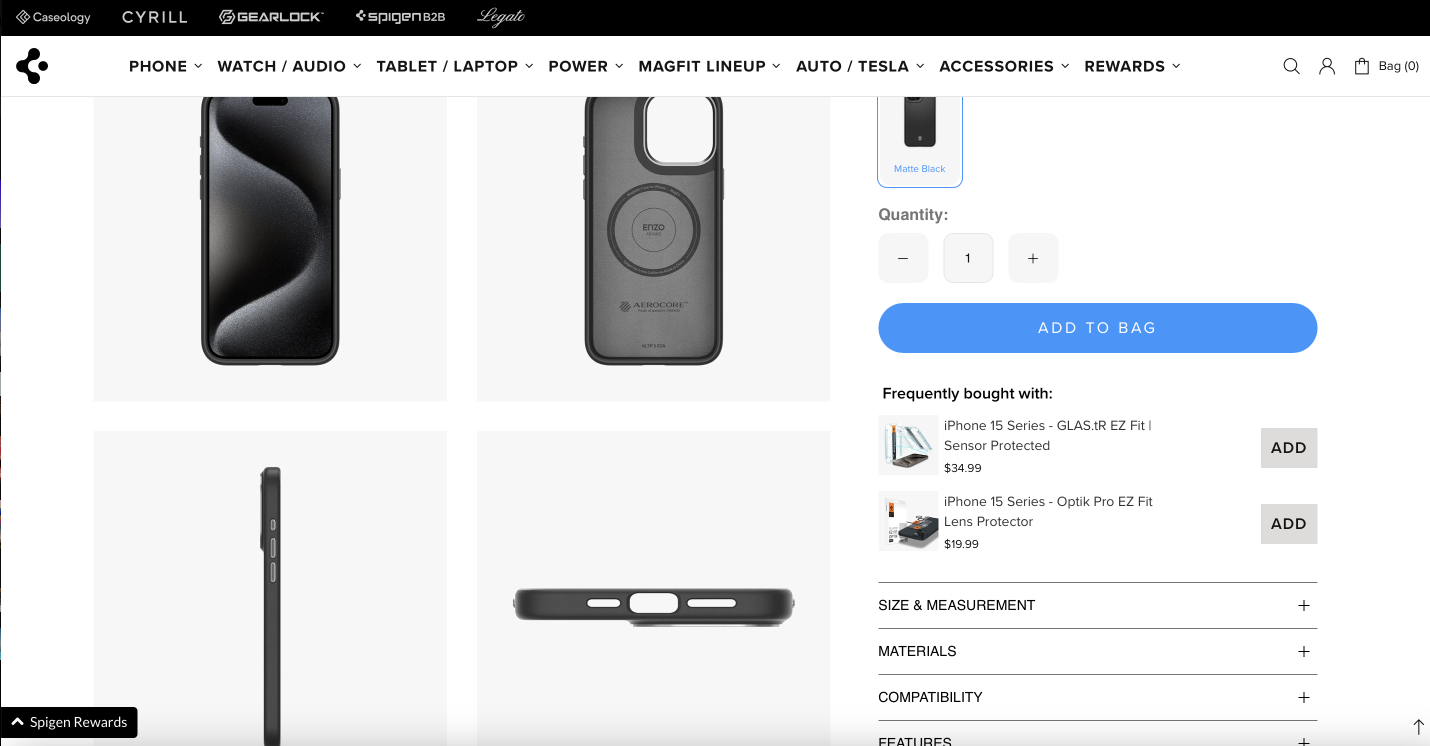
The key is presentation. Use a clear heading such as "Add these accessories", "Complete your order", or "Works well with". Show a small image, short product title, price, and a very obvious selection control.
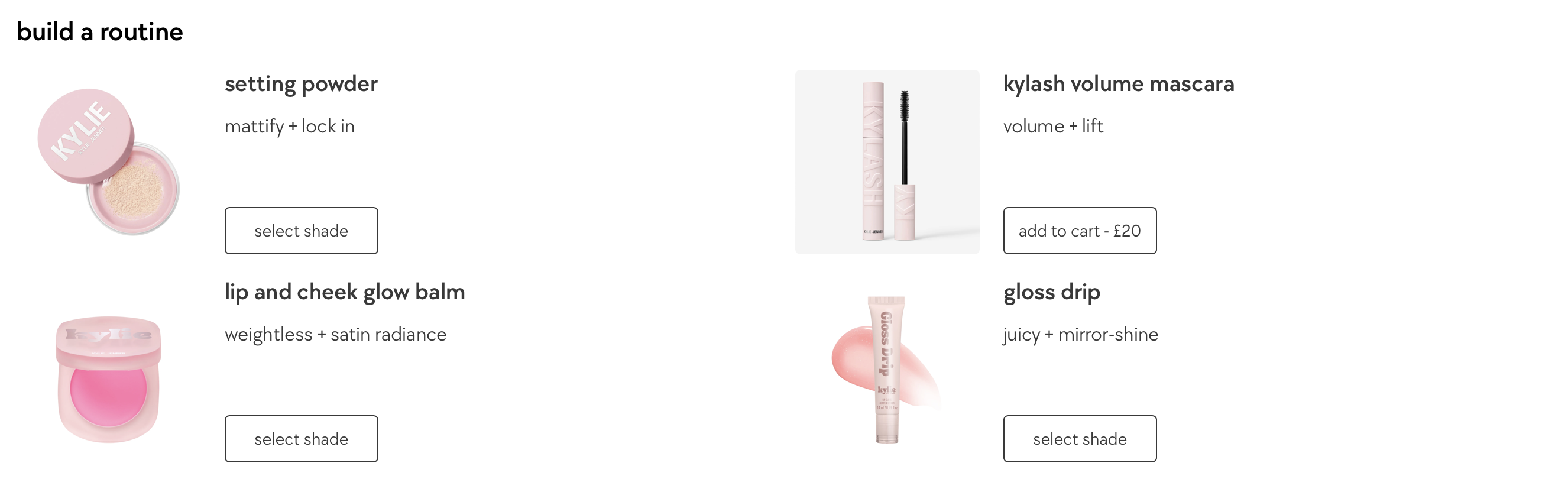
Should I use related products or a Pair It With section?
Yes, a Pair It With or related products section is one of the best low-friction ways to display accessories. It works particularly well when the accessory is optional rather than essential.
This format feels more like merchandising than upselling, which can improve shopper trust. It is ideal for fashion, beauty, homeware, tech, and gifting stores where the accessory adds context or style rather than solving a functional need.
If you want ideas for this exact format, see Display “Pair It With” & “Combine It With” on Shopify and how best to add Shopify related products to a product page. Those layouts often outperform generic recommendation widgets because they feel curated.

Should I use product variants for accessories?
You can use product variants for accessories, but only in limited cases. Variants work best when the accessory is tightly tied to the main product and does not need separate merchandising, inventory logic, or discovery.
For example, a monogram option, gift box, cable length, or add-on finish may fit naturally as a variant or option. But a separate accessory product like a bag, charger, or cleaning kit is usually better managed as its own product with its own inventory and merchandising.
I see merchants misuse variants all the time by cramming unrelated accessories into the options selector. That can confuse shoppers and create inventory headaches. If the item should be bought on its own, searched independently, or featured elsewhere, keep it as a separate product.
For more on structuring add-ons properly, read how to create product add-ons for your Shopify store and how to display customizable add-ons and upsells on Shopify.
Are bundles or kits better for accessory sales?
Bundles or kits are better when customers commonly buy the same combination of products together. They reduce decision fatigue and make the value proposition more obvious.
If you sell a hero product with a predictable set of accessories, a bundle can outperform a loose accessory section. Think starter kits, care kits, travel sets, or complete setups. In my experience, bundles work best when there is a clear use case and a visible saving.
For example, instead of listing a yoga mat, strap, block, and towel separately, create a "Beginner Yoga Kit". Instead of showing a coffee machine with scattered extras, create a "Home Barista Bundle". The simpler the decision, the better the conversion rate tends to be.
If bundling is central to your strategy, I recommend reading how to create product kits for your Shopify store.
What Shopify apps can help display product accessories?
The best Shopify apps for displaying accessories are the ones that make add-ons easy to configure, visually clear, and simple to add in one click. The right app depends on whether you need curated accessories, custom options, or automated recommendations.
The research around this topic consistently points merchants towards apps in three broad categories: upsell apps, product options apps, and frequently bought together apps. Here is how I think about them.
| App type | Best for | Strengths | Watchouts |
|---|---|---|---|
| Upsell app | Showing accessories on product pages and in cart | Fast setup, strong placements, one-click add-ons | Can feel pushy if overused |
| Product options app | Customisable add-ons like gift wrap, engraving, extras | Flexible options, checkboxes, required fields | Not always ideal for standalone accessory products |
| Frequently bought together app | Automated accessory suggestions based on order patterns | Data-driven recommendations, strong for larger catalogues | Needs enough sales data to shine |
The latest community advice and merchant feedback also often mentions Bold Product Options, Infinite Options, and Frequently Bought Together for accessory displays. If you mention or evaluate these in your own research, link to their app listings before installing and check whether they support your theme, cart setup, and Shopify plan.
SellUp is a good fit when you want a straightforward upsell flow for accessories and complementary products. For merchants focused on custom extras, option-based tools can be a better fit. For stores with enough order history, frequently-bought-together style recommendations can automate a lot of the pairing work.
Where should product accessories appear on a Shopify store?
Accessories should appear on the product page first, then in the cart, and optionally in collections or dedicated accessory landing pages. The product page is usually the highest-intent placement.
Placement matters more than most merchants think. I have seen stores with great accessory products underperform simply because the offers were buried too far down the page or hidden behind tabs.
What is the best product page placement for accessories?
The best product page placement is close to the Add to Cart area, ideally just below the buy box or immediately after the main product description. This keeps the accessory visible while purchase intent is highest.
Use concise labels such as "Complete the set", "Recommended accessories", or "Frequently bought together". Show no more than 3 to 5 items by default. On mobile, fewer is often better.
Avoid making shoppers scroll through a carousel of ten irrelevant products. If everything is recommended, nothing feels recommended.
Should I also show accessories in the cart?
Yes, cart upsells work well for low-cost, high-margin accessories. They are especially effective when the shopper skipped the product page offer or added the main product from a collection page.
This is a good place for practical extras like batteries, care products, gift wrap, spare parts, or impulse accessories. The cart is not the place for a complicated decision. Keep it quick, relevant, and easy to dismiss.
If you are trying to improve this stage more broadly, my guide on how to show recommended products on Shopify covers the wider recommendation strategy too.
Do dedicated accessories collections help?
Yes, dedicated accessories collections help with browsing, SEO, and repeat purchases. They are not a replacement for product page placement, but they are a useful supporting layer.
Create clear collections such as Phone Accessories, Camera Accessories, Care Kits, or Gift Add-Ons. Then link to them from navigation, product pages, or help content. This helps shoppers who are actively looking for extras and gives Google clearer category signals too.
What are the best practices for displaying product accessories?
The best practices are simple presentation, strong relevance, clear pricing, and mobile-friendly design. Most accessory sections fail because they are either too busy or not specific enough.
When I test Shopify stores, the biggest issue is usually not lack of accessories. It is poor merchandising. Merchants often show the wrong products, too many products, or place them too far from the buying action.
How do I keep accessory displays simple and organised?
Keep accessory displays simple by grouping only the most relevant add-ons and using a clean visual layout. Shoppers should understand the offer in seconds.
- Show 3 to 5 accessories maximum on the main block
- Use small product images, short titles, and visible pricing
- Group accessories by purpose, such as protection, care, gifting, or upgrades
- Avoid mixing unrelated recommendations into the same section
- Make sure the section looks good on mobile first, not desktop first
A cluttered page lowers confidence. A tidy accessory section improves discoverability and feels more premium.
How do I highlight related products without hurting conversion?
Highlight related products by focusing on relevance and benefit, not just product count. The accessory should clearly improve or complete the main purchase.
For example, instead of showing random products from the same collection, explain the connection. A line like "Protect your new headphones with a hard-shell carry case" is far stronger than simply listing the case under a generic heading.
I also recommend using visual cues such as badges, compact icons, or short labels like Best seller, Most chosen, or Essential add-on. If you use product tags to power those labels, this guide on how to display product tags on Shopify can help.
How much detail should I show for each accessory?
Show enough detail to remove hesitation, but not so much that the section becomes overwhelming. In most cases, title, image, price, and one short benefit line is enough.
If the accessory has compatibility requirements, mention them clearly. This is especially important for electronics, replacement parts, vehicle accessories, and products with size or model dependencies. Returns caused by unclear compatibility are avoidable.
Good examples of short benefit text include:
- Water-resistant case for everyday protection
- Fits all 500ml bottles in this collection
- Add gift wrap and a handwritten note
- Compatible with iPhone 15 range only
Do accessory images really matter?
Yes, high-quality accessory images matter because shoppers often make quick visual decisions on low-cost add-ons. If the image is weak, the accessory is easier to ignore.
Use consistent backgrounds, clear crops, and images that make sense next to the main product. If possible, show the accessory in context. A standalone charger image is fine, but a charger shown next to the device it supports is usually better.
Shopify's own merchandising guidance also reinforces the importance of product display and visual emphasis. For broader merchandising principles, Shopify's article on product merchandising is worth reading.
Should you use an app or customise your Shopify theme code?
Most merchants should start with an app, not custom code. Apps handle around 80% of accessory display use cases without the maintenance burden of theme customisation.
That said, custom code can make sense if you need highly specific logic, such as required accessories, conditional accessories based on product tags, or a completely bespoke layout. For example, you might use Liquid conditions to show accessories only when a product has a certain tag or belongs to a certain type.
In my experience, custom code is best reserved for stores with a developer on hand and a clear reason not to use an app. Otherwise, every theme update becomes a small project. Shopify theme architecture has improved a lot, but maintenance still matters.
If you do go custom, review Shopify's developer documentation at shopify.dev and test on mobile, cart drawers, and accelerated checkout flows before publishing.
What mistakes should you avoid when displaying accessories?
The biggest mistakes are showing too many accessories, recommending irrelevant products, and making add-ons hard to understand or add. These issues reduce trust and hurt conversion.
- Showing too many options - This creates decision fatigue and weakens the main product page.
- Using generic recommendations - Accessories should be genuinely complementary, not just loosely related.
- Hiding prices - Shoppers want to know the extra cost immediately.
- Poor mobile layout - A desktop-friendly grid can become unusable on mobile.
- No compatibility messaging - This is a common source of confusion and returns.
- Forcing accessories too early - Mandatory-looking upsells can feel manipulative if the product does not require them.
One practical test I like is this: if a first-time visitor cannot understand the accessory offer in 5 seconds, it probably needs simplifying.
How do I set up product accessories on Shopify step by step?
The simplest setup is to choose your key accessories, add them to the product page with an app or theme block, then test performance. You do not need a complex build to get started.
- Identify your top accessory opportunities by looking at common co-purchases, support questions, and obvious product pairings.
- Prioritise high-margin, relevant accessories rather than every possible add-on.
- Add a product page accessory block using an app like SellUp or your theme's related product section.
- Write a clear heading such as "Complete the set" or "Recommended accessories".
- Limit the selection to 3 to 5 products with images, price, and a fast add action.
- Add a cart upsell for lower-cost extras shoppers may have skipped.
- Create bundles for the most common combinations.
- Track results in Shopify analytics and your app dashboard, looking at attachment rate, AOV, and conversion rate.
When I work through this with merchants, I usually recommend launching the simplest version first. A clean accessory block live this week is better than a perfect custom build that never ships.
What does a good Shopify accessory strategy look like in 2026?
A good 2026 accessory strategy is curated, data-informed, mobile-first, and easy to maintain. It combines manual merchandising with automation where it makes sense.
That means using your best judgement for obvious pairings, while also learning from order behaviour over time. It means designing for mobile from the start, because that is where many impulse add-ons happen. And it means avoiding bloated pages that try to recommend everything at once.
In my experience building Shopify apps and watching how merchants actually use them, the stores that win are not the ones with the most complicated setup. They are the ones that make the next best purchase feel obvious, useful, and easy to add.
If you want to improve accessory sales specifically, start with one strong product page block, one cart upsell, and one bundle offer. That is usually enough to learn what your customers actually respond to before you expand further.