
You can add dark mode to a Shopify store in 2026, but Shopify still does not offer a universal native dark mode switch for storefronts or the admin. In practice, the best options are theme colour schemes, a no-code dark mode app, or custom CSS and JavaScript if you want full control.
In my experience building Shopify apps and working with merchants on theme customisation, dark mode sits in an interesting middle ground. It is not essential for every store, but when it fits the brand and is implemented properly, it can make a store feel more modern, more accessible, and simply nicer to browse at night.
If you just want the short answer: yes, you can make Shopify dark mode. The easiest route is to use your theme's built-in colour settings or install a dedicated app like Easy Dark Mode. If you are comfortable editing code, you can also use prefers-color-scheme and a manual toggle for a cleaner, brand-safe result.

What is dark mode on a Shopify store?
Dark mode is a darker visual version of your storefront that swaps light backgrounds for dark ones and adjusts text, buttons, borders, and other UI elements for readability. It can be triggered by a manual toggle, the shopper's device preference, or both.
On Shopify, dark mode usually means changing theme colours rather than flipping a magical platform-wide setting. That matters because a proper dark mode is not just black backgrounds. You also need to think about contrast ratios, image visibility, logo variants, and how dynamic elements like carts, popups, reviews, and app blocks look in darker palettes.
The original version of this article was right about one thing that still holds up in 2026: dark mode is mostly a CSS problem. The difference now is that modern Shopify themes and apps make it much easier to implement without rebuilding half your storefront.
Do you actually need dark mode on Shopify in 2026?
No, not every Shopify store needs dark mode. But for some brands, it is absolutely worth adding, especially if your audience shops on mobile, browses at night, or expects a more premium, modern interface.
I would not treat dark mode as a universal conversion trick. It is better viewed as a design and accessibility enhancement. If your store already has a strong visual identity with dark packaging, luxury branding, gaming products, tech accessories, or nightlife-related products, a dark mode can feel very natural.
Where merchants go wrong is assuming users want a crude inverted version of the site. They do not. A bad dark mode can make product photography look muddy, hide icons, and reduce trust. A good one feels intentional.
As of 2026, Shopify itself still does not provide a built-in storefront dark mode toggle across all themes, and there is still no native dark mode for the Shopify admin. That means you need to choose the right implementation method rather than expecting Shopify to handle it for you.
What is the best way to add dark mode to Shopify?
The best way depends on your theme, technical ability, and how polished you want the result to be. For most merchants, I recommend starting with theme colour schemes. For non-technical stores that want a quick toggle, a dark mode app is the easiest route. For developers, custom code gives the best long-term control.
Here is the practical comparison I would use if I were choosing for my own store.
| Method | Pros | Cons | Best for |
|---|---|---|---|
| Theme colour schemes | Free, built-in, no extra app, easy to test | No universal toggle in some themes, more manual setup | Most stores using modern Shopify themes |
| Dark mode app | Fast setup, customer toggle, auto-detect system preference | Monthly fee, styling can be less precise | Non-coders who want one-click implementation |
| Custom code | Full control, brand-safe, no recurring app cost | Needs coding, testing, and maintenance | Developers and custom storefronts |
If your store relies heavily on conversion-focused page design, I would also read our guide on how to maximise revenue from your Shopify product pages. Dark mode should support conversion, not undermine it.
How do I add dark mode using Shopify theme colour schemes?
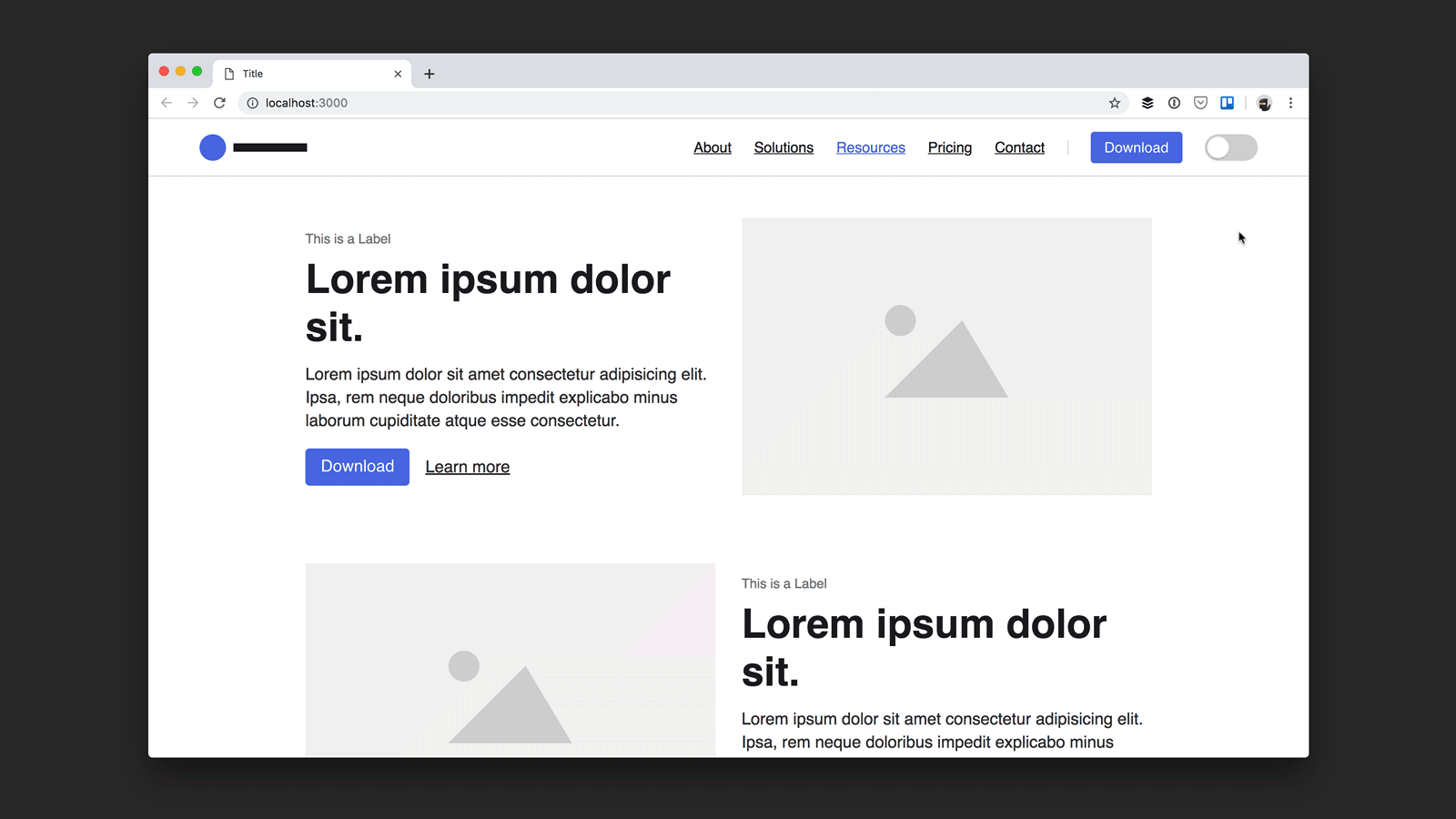
The easiest no-code method is to create a dark colour scheme in your theme editor. Many Online Store 2.0 themes support multiple colour schemes that you can apply across sections or use as the basis for a dark visual style.
This is the first option I would try on Dawn or any modern theme. It is free, fast, and much safer than installing an app before you know whether dark mode suits your brand.
- Go to Online Store > Themes.
- Click Customize on your live theme or a duplicate.
- Open Theme settings > Colours.
- Click Add colour scheme if your theme supports it.
- Set a dark background such as #000000 or a softer charcoal.
- Use light text, subtle borders, and accessible accent colours.
- Apply the scheme to relevant sections and preview all templates.
The catch is that this often creates a dark design system, not a true user-controlled dark mode. In other words, it may let you style sections dark, but it may not give shoppers a front-end toggle by default.
Still, for plenty of stores, that is enough. If your brand is already dark-first, using colour schemes may be the best free option.
What should you change in a dark Shopify colour scheme?
You need to change more than background and text colours. The most common dark mode problems come from forgotten elements like announcement bars, badges, borders, icons, form fields, and app embeds.
- Backgrounds: use dark grey or charcoal, not always pure black
- Body text: use off-white instead of harsh pure white
- Buttons: keep strong contrast and obvious hover states
- Borders and dividers: lighten them enough to remain visible
- Input fields: ensure placeholders and labels are readable
- Product cards: check shadows, badges, and sale labels
- Logos: prepare a light version if your default logo is dark
I also strongly recommend checking your contrast against WCAG contrast guidance. A minimum 4.5:1 contrast ratio for normal text is still the baseline merchants should aim for.
If accessibility is already on your radar, our post on website accessibility lawsuits for Shopify merchants is worth reading next.
How do I add dark mode to Shopify with an app?
The easiest one-click route is a Shopify app that adds a dark mode toggle and auto-detects the shopper's system preference. This is the best option if you do not want to touch code and your theme does not offer the behaviour you want.
One of the most visible options in 2026 is Easy Dark Mode. Based on current app listings and third-party coverage, it is designed to work across browsers, operating systems, and Shopify themes, with a simple on-site widget for customers.

Easy Dark Mode is positioned as a no-code solution with pricing starting from $1.99/month according to current public listings. That is inexpensive enough for testing, but I would still preview it carefully because dark mode apps can vary a lot in how cleanly they handle product media, app blocks, and custom sections.
There are also other app options mentioned across the ecosystem, including tools marketed as Darkify, Dark Mode Toggle, Night Theme, and Dark Mode Switch. Before installing any of them, I would check three things:
- Whether the app adds a manual toggle
- Whether it respects system theme preferences
- Whether it lets you customise colours and widget placement
As an app developer, this is the bit I care about most: app compatibility. If your store uses review apps, bundles, upsells, subscription widgets, or custom cart drawers, test them all. A dark mode app can look great on the homepage and still break the visual consistency of your highest-converting areas.
That is especially important if you are running upsell flows. If that is part of your stack, see how to create Shopify cart drawer upsells that boost AOV and how to upsell on Shopify in 2026.
How do I add dark mode to Shopify with custom code?
The best developer-friendly method is to use CSS variables with the prefers-color-scheme media query, then optionally add a manual toggle with JavaScript. This gives you the cleanest implementation and the most control over branding.
In my experience, this is the only approach that consistently feels premium on custom storefronts. It avoids the heavy-handed feel of some generic inversion tools and lets you design dark mode properly rather than hoping an app guesses your colours correctly.
Step 1: Define colour variables
Use CSS custom properties so you can switch theme values centrally. Add these to your main stylesheet or theme CSS file.
:root {
  --bg: #ffffff;
  --text: #111111;
  --muted: #666666;
  --card: #f7f7f7;
  --border: #e5e5e5;
  --button-bg: #111111;
  --button-text: #ffffff;
}

@media (prefers-color-scheme: dark) {
  :root {
    --bg: #0f0f10;
    --text: #f5f5f5;
    --muted: #b3b3b3;
    --card: #17181a;
    --border: #2a2b2e;
    --button-bg: #ffffff;
    --button-text: #111111;
  }
}
Step 2: Apply the variables to your theme
Map those variables to real theme elements like the body, headers, cards, and buttons.
body {
  background: var(--bg);
  color: var(--text);
}

.card, .product-card, .collection-card {
  background: var(--card);
  border-color: var(--border);
}

.button, button, .btn {
  background: var(--button-bg);
  color: var(--button-text);
}

input, select, textarea {
  background: var(--card);
  color: var(--text);
  border: 1px solid var(--border);
}
Step 3: Add a manual toggle if you want one
A manual toggle improves usability because not every shopper wants their system preference enforced. This is especially useful for stores with photography-heavy pages.
You can add a small button in your header and use JavaScript to switch a class on the html element while storing the preference in localStorage.
<button id="theme-toggle" type="button">Toggle dark mode</button>

<script>
  const root = document.documentElement;
  const savedTheme = localStorage.getItem('theme');

  if (savedTheme) {
    root.setAttribute('data-theme', savedTheme);
  }

  document.getElementById('theme-toggle').addEventListener('click', function () {
    const current = root.getAttribute('data-theme') === 'dark' ? 'light' : 'dark';
    root.setAttribute('data-theme', current);
    localStorage.setItem('theme', current);
  });
</script>
Then add CSS overrides for the manual state:
[data-theme="dark"] {
  --bg: #0f0f10;
  --text: #f5f5f5;
  --muted: #b3b3b3;
  --card: #17181a;
  --border: #2a2b2e;
  --button-bg: #ffffff;
  --button-text: #111111;
}
If you are editing a live Shopify theme, duplicate it first. I still see merchants make changes directly on production, which is risky even for small CSS updates.
What are the biggest dark mode mistakes on Shopify?
The biggest mistakes are poor contrast, broken logos, unreadable app widgets, and untested product pages. Dark mode often looks easy in a homepage mock-up and much harder on a real ecommerce store.
When I test storefront changes, I spend more time on edge cases than on the homepage hero. That is because the money pages on Shopify are usually product templates, cart drawers, upsell modals, bundles, review widgets, and account pages.
- Using pure black everywhere: this can feel harsh and flatten your design
- Forgetting images and logos: dark logos disappear on dark backgrounds
- Ignoring apps: embedded widgets may keep light backgrounds
- Weak button contrast: CTAs become less obvious
- No mobile testing: dark mode issues often appear first on smaller screens
- No accessibility checks: readable does not always mean compliant
If your store already has performance issues, do not let dark mode become another layer of messy front-end code. Our article on Shopify speed optimisation scams explains why quick fixes can create long-term problems.
Which Shopify themes work best for dark mode?
The best Shopify themes for dark mode are modern Online Store 2.0 themes with flexible colour schemes and clean CSS structure. Dawn is the obvious starting point, but premium themes with strong section-level colour controls can also work very well.
The original article mentioned themes like Eurus, Digital, and Pipeline as dark-mode-friendly options. That is still directionally useful, but in 2026 I would assess themes based on colour scheme flexibility, section consistency, and how easy they are to override safely.
| Theme type | Dark mode suitability | Why |
|---|---|---|
| Dawn and similar OS 2.0 themes | Very good | Flexible colour schemes, broad support, easier customisation |
| Premium visual themes | Good to very good | Often strong styling controls, but app compatibility varies |
| Older heavily customised themes | Mixed | Dark mode is possible, but technical debt makes it slower |
Before changing themes just for dark mode, ask whether your current store would benefit more from better merchandising, reviews, or AI search visibility. For example, if discoverability is the bigger issue, read how to get your Shopify store into ChatGPT and how to optimise your Shopify store for AI shopping agents.
Can you add dark mode to the Shopify admin?
Not natively. Shopify still does not offer an official dark mode for the admin dashboard in 2026, so if you want a darker backend experience, you will need a browser extension.
The two most common tools are Dark Reader and Night Eye. These can apply dark styling to shopify.com/admin, though the quality varies by page and extension settings.
I use extensions sparingly for admin interfaces. They are fine for reducing glare, but they are not the same as a native dark UI. Expect occasional pages or embedded tools to look slightly off.
How should you test dark mode before publishing?
You should test dark mode on real devices, real templates, and real customer journeys. A quick homepage preview is not enough.
Here is the checklist I use when reviewing front-end changes for Shopify stores:
- Test homepage, collection, product, cart, and checkout-adjacent flows
- Check mobile and desktop
- Review logos, icons, trust badges, and payment icons
- Open all apps and embedded widgets
- Test announcement bars, popups, and slide-out carts
- Measure text contrast using a tool like WebAIM Contrast Checker
- Check image-heavy pages on OLED mobile screens
- Ask whether the dark version still feels on-brand
If dark mode reduces clarity on your product pages, it is not ready. Ecommerce design has to serve trust and conversion first.
Is dark mode good for conversion rates?
Dark mode can improve user experience, but it is not guaranteed to increase conversion rates. The impact depends on your audience, product category, brand style, and execution quality.
In my experience, dark mode tends to work best when it aligns with the brand rather than being bolted on as a trend. Premium fashion, gaming, tech, music, nightlife, and certain luxury categories often suit it well. Bright, natural, wellness, or handmade brands sometimes perform better with lighter palettes.
That is why I treat dark mode as something to test, not assume. If you want to evaluate it properly, compare metrics such as:
- Bounce rate
- Time on page
- Add-to-cart rate
- Cart completion rate
- Mobile conversion rate
If your goal is purely increasing AOV or conversion, dark mode may not be the highest-impact change. You may get better returns from upsells, reviews, urgency, or product page optimisation first.
So what is my recommendation for Shopify dark mode in 2026?
Start simple. If your theme supports colour schemes, build a dark version there first. If you need a customer-facing toggle without code, test Easy Dark Mode or a similar app on a duplicate theme. If your brand truly benefits from dark mode and you want the cleanest result, invest in a custom implementation.
That is the honest answer from someone who has spent years building in the Shopify ecosystem. Dark mode is worth doing when it is intentional. It is not worth doing badly.
The stores that get this right usually treat dark mode as part of a broader design system, not a gimmick. They make sure the logo works, the product photography still sells, the buttons remain obvious, and the whole experience feels polished from homepage to cart.
If you want to keep improving the storefront around it, I would also check out how to add a falling snow effect to your Shopify store for seasonal design ideas and Shopify's new unlisted product status if you are also refining product visibility strategy.