
A "Shop the Look" section lets shoppers buy multiple complementary products from one visual block, usually from a lifestyle image or a curated product set. On Shopify, the best way to add it depends on your theme, your budget, and how much control you want over the design.
In my experience building Shopify apps and working with merchants on upsells, Shop the Look is one of the simplest ways to increase average order value without making the buying journey feel pushy. It works especially well for fashion, home decor, beauty, gifting, and lifestyle brands where context matters and customers want help putting products together.
If you want the short version, you have three practical options: use a theme with a built-in Shop the Look section, add a custom Liquid section to a theme like Dawn, or use a Shopify app such as SellUp for the fastest setup. Below, I will walk through all three methods, when to use each one, and how to make the section convert.
What is a Shop the Look section on Shopify?
A Shop the Look section is a shoppable content block that groups related products together so customers can buy a full outfit, room setup, or bundle from one place. It is essentially a cross-sell and merchandising feature presented in a more visual way than a standard product recommendation carousel.
You will usually see it on product pages, home pages, or landing pages. A merchant might show a model wearing a jacket, jeans, and trainers, or a styled living room containing a lamp, rug, and side table. Instead of making the customer hunt for each item, the section links or adds each product directly from the same area.
This matters because convenience drives conversion. In ecommerce generally, cross-sells and bundles can lift revenue materially, and merchants often report 20 to 30 percent uplift from well-placed upsell experiences. In my experience, the stores that do best with Shop the Look are not necessarily the biggest ones, but the ones that make the decision easy.
If you are comparing terminology, Shop the Look and Complete the Look are often used interchangeably. If you want more ideas around this broader merchandising style, I have also covered it here: How to Create a “Complete the Look” Section in Shopify.
Why should you add a Shop the Look section to your Shopify store?
You should add a Shop the Look section if you want to increase average order value, improve product discovery, and make styling or bundling easier for customers. It is one of the few conversion tactics that can improve both user experience and revenue per visitor at the same time.
When I test upsell placements for Shopify merchants, standard recommendation widgets often perform decently, but visual bundles almost always feel more intuitive. Customers do not just see random related products. They see a complete idea. That context is powerful.
Here are the main benefits:
- Higher AOV by encouraging multi-item purchases
- Better product discovery for accessories, add-ons, and lower-visibility items
- Stronger merchandising through lifestyle imagery and curated sets
- Less friction because shoppers can add complementary items without extra browsing
- Improved mobile shopping when implemented as a clean, scrollable section
For many stores, this works best alongside other merchandising tactics such as featured products, add-ons, and in-cart offers. If that is part of your plan, these guides may help too: How to Add Featured Products on Shopify and How to Create Product Add-Ons for Your Shopify Store.
What is the best way to add a Shop the Look section in Shopify?
The best method depends on your setup. If your theme already includes the feature, use that first. If you want full control and are comfortable editing code, build a custom section. If you want the quickest route with the least friction, use an app.
Most merchants should choose based on this simple rule:
- Use a built-in theme section if your theme supports it natively
- Use custom code if you are on Dawn or another OS 2.0 theme and want flexibility without app costs
- Use an app if you want speed, support, and easier management across pages
| Method | Best for | Ease | Cost | Customisation | Theme compatibility |
|---|---|---|---|---|---|
| Built-in theme section | Merchants using a theme with native support | High | Free | Medium | Theme-specific |
| Custom Liquid section | Merchants on Dawn or OS 2.0 themes wanting control | Medium | Free | High | Most OS 2.0 themes |
| App-based setup | Merchants wanting the fastest no-code route | Highest | Free or paid | High | Broad compatibility |
My honest take is this: apps are usually the fastest way to validate the concept, while custom sections are better once you know exactly how you want it to work. I have seen merchants waste time coding advanced layouts before proving that the offer itself converts.
How do I add a Shop the Look section using a Shopify app?
Using an app is the easiest way to add a Shop the Look style experience to most Shopify stores. It is ideal if you want to launch quickly, test placements, and avoid editing theme files.
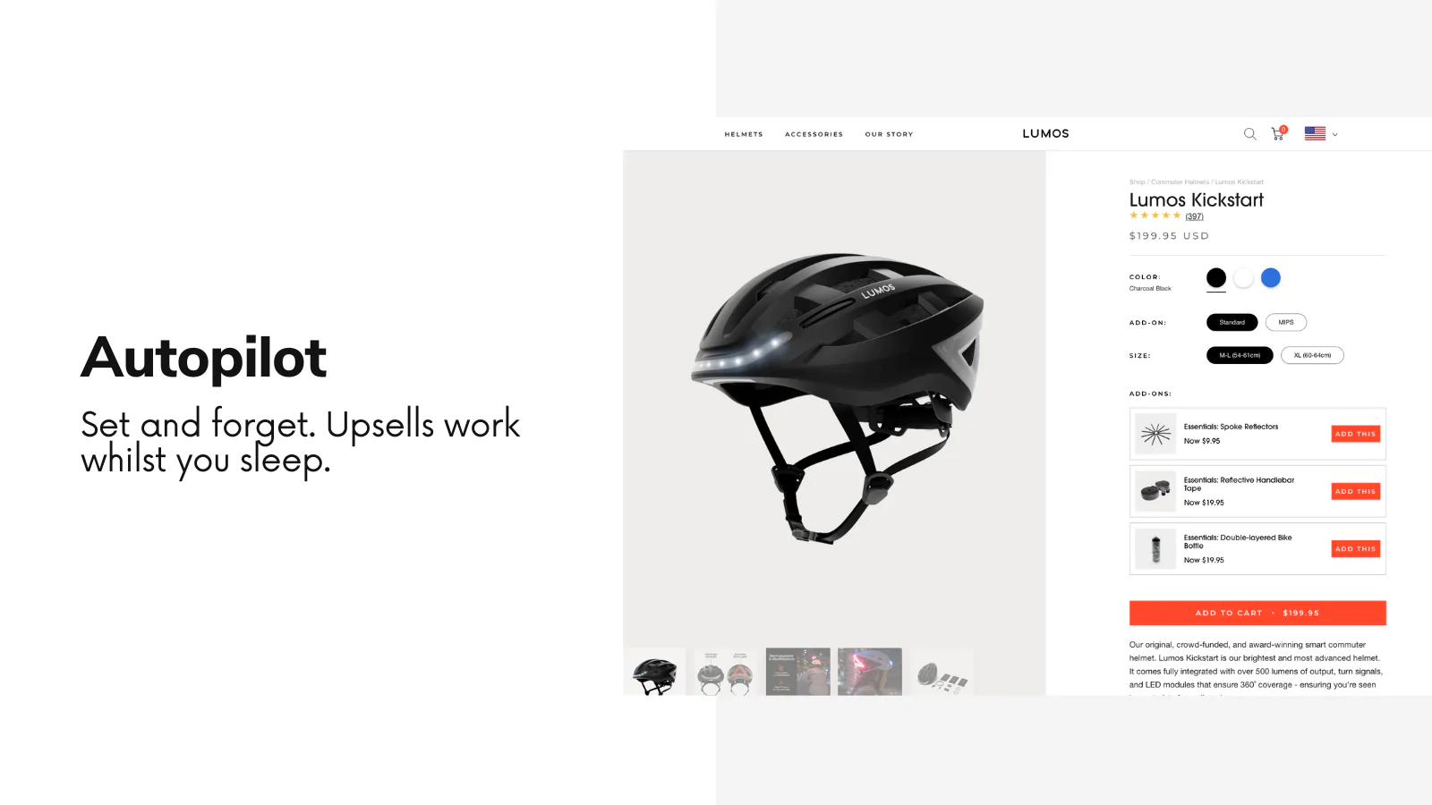
For merchants who want a simple upsell-driven approach, I usually recommend starting with SellUp. It is built for on-page offers, product upsells, and complementary product suggestions, which makes it a practical fit for a Shop the Look workflow even if your theme does not have a native visual hotspot section.

Step 1: Add SellUp to your Shopify store
The first step is to install SellUp from the Shopify App Store. This gives you the tools to create on-page offers that can act like a curated complete-the-look section on your product pages.
In my experience, merchants often overcomplicate this stage. You do not need a custom build on day one. If your goal is to get complementary products showing beneath the main product and make them easy to add, an app setup is often more than enough to start testing.
Step 2: Create a lifestyle image that shows the products together
A strong Shop the Look section needs a clear lifestyle image or styled visual that makes the combination feel intentional. The image is what turns a basic cross-sell into a merchandising tool.
If you already have branded photography, use that. If not, keep it simple. I have seen merchants get excellent results with a clean flat lay, a phone camera, natural light, and a consistent editing style. For wearable products, model shots usually perform best because customers can picture the full look more easily.
You can also use external services like Fiverr for product photography, or partner with creators and influencers who can style the products naturally. Just make sure the final image does not feel cluttered. Three to five products is usually the sweet spot.
Step 3: Create an on-page offer for complementary products
Once the app is installed and your visual is ready, create an on-page offer tied to a product that acts as the anchor item. Then select the supporting products that complete the look.
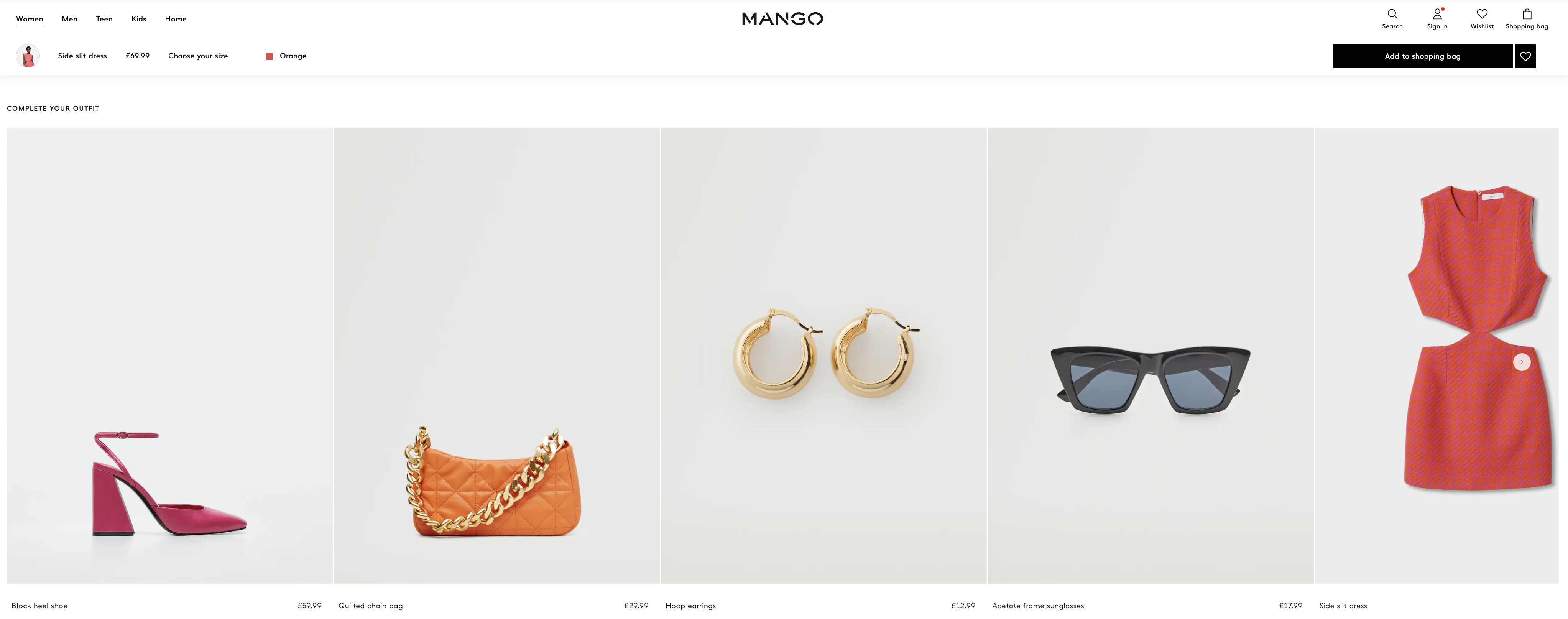
For example, if the main product is a dress, the offer might include sandals, a bag, and earrings. If the main product is a sofa, the offer might include cushions, a throw, and a side table. The key is relevance. Do not add products just because they need more exposure. Add them because they genuinely make sense together.
In many setups, these offers appear beneath the Add to Cart button or within the product page layout. That is usually where I have seen the best performance, because the customer is already in buying mode and does not need to navigate away.
For inspiration, brands like Mango use complete-the-look style merchandising to keep shoppers on the same page while encouraging multi-item purchases.
Step 4: Test the placement and product mix
The first version is rarely the best version. Test which products you group together, how many you show, and where the section appears.
In my experience, the biggest wins usually come from small tweaks: reducing the number of products from five to three, changing the lead image, or moving the section closer to the Add to Cart area. If you want to support the offer with extra explanatory text in the cart, this guide can help: How to Add Text to the Shopify Cart Page.
How do I add a Shop the Look section using a built-in Shopify theme feature?
If your theme includes a native Shop the Look section, this is often the cleanest and cheapest option. You can add it directly in the theme editor without installing an app or editing code.
Some premium themes include this feature out of the box. For example, certain versions of the Gain theme include a dedicated Shop the Look section where you can upload an image, add products, and position them visually.
- Go to Online Store > Themes
- Click Customize on your live or duplicate theme
- Choose the template where you want the section to appear
- Click Add section
- Search for Shop the Look
- Add your image, select the products, and adjust the layout
- Save and preview on desktop and mobile
This method is ideal if your theme handles the styling well and gives you enough control over spacing, product count, and mobile behaviour. The downside is that theme-native sections can be limited. If you want more advanced hotspot positioning, custom interactions, or different layouts per template, you may outgrow the built-in feature quickly.
How do I add a Shop the Look section to Dawn or another OS 2.0 theme with code?
You can add a Shop the Look section to Dawn by creating a custom Liquid section and then adding product blocks with image hotspot positions. This is the best free option if you want full control and are comfortable editing theme code.
I only recommend this route if you are happy working in Shopify theme files or have a developer who can help. Always test on a duplicate theme first so you are not making changes directly on your live storefront.
Step 1: Create a new section file
Go to Online Store > Themes > Actions > Edit code. In the Sections folder, create a new section called shop-the-look.liquid.
Step 2: Add the Liquid schema and section markup
Paste in the custom section code that allows you to upload an image, define a title and CTA text, and add product blocks with top and left percentage controls. This lets you place products over the image like clickable hotspots.
Community examples for this approach are widely shared and work well as a starting point. The principle is simple: the section displays a background image, then loops through product blocks and positions each linked product card using percentage-based coordinates.
Step 3: Add the section in the theme editor
Once saved, go back to the Theme Editor, add the new section to a product page or landing page, upload your lifestyle image, and assign products to each block. Then use the slider controls to place each product on the image.
Step 4: Improve mobile responsiveness
This is the part many tutorials skip. A custom Shop the Look section can look great on desktop and terrible on mobile if you do not adjust spacing, text size, and tap targets.
At a minimum, make sure that:
- Hotspots are large enough to tap on a phone
- Product cards do not overlap on smaller screens
- Text remains readable over the image
- Images are compressed so the section does not slow the page down
If you are already customising product page layouts, you may also want to review related merchandising guides like How to Add an Image Slider to Products in Shopify and How to Display Customizable Add-Ons & Upsells on Shopify.
What should a high-converting Shop the Look section include?
A high-converting Shop the Look section should include a strong image, a clear product relationship, easy add-to-cart paths, and a mobile-friendly layout. Good design matters, but relevance matters more.
From what I have seen across Shopify stores, the best-performing sections usually include these elements:
- One anchor product that matches the page context
- Two to four complementary items, not a huge list
- A lifestyle image that shows the products naturally together
- Clear pricing so shoppers know what to expect
- Fast add-to-cart or quick-view actions
- Consistent styling with your theme fonts and colours
- Mobile optimisation for smaller screens
One mistake I see often is merchants trying to force a bundle where there is no natural connection. A customer can tell when a section is genuinely helpful versus when it is just there to squeeze out another item. Relevance beats aggression every time.
Where should you place a Shop the Look section on Shopify?
The best place for a Shop the Look section is usually on the product page, close to the main purchase area or lower down as a supporting recommendation block. It can also work on the home page, collection landing pages, and campaign pages.
If you are only adding it in one place, start with the product page. That is where purchase intent is strongest. A customer already considering one item is more likely to add matching products than someone casually browsing the home page.
| Placement | Best use case | Pros | Cons |
|---|---|---|---|
| Product page | Complementary product upsells | High intent, strong AOV potential | Can compete with other product page elements |
| Home page | Brand storytelling and merchandising | Great visual impact | Lower buying intent |
| Collection page | Category-level styling inspiration | Useful for discovery | Can clutter browsing if overused |
| Landing page | Campaigns, seasonal edits, influencer looks | Highly curated | Needs traffic support |
If you are building out richer merchandising pages, you might also find this useful: How to Add Products to Specific Pages on Shopify in 2026.
Which products work best in a Shop the Look section?
The best products for Shop the Look are complementary, visually related, and easy to buy together. Think outfits, room sets, skincare routines, gift pairings, or accessory bundles.
Here are some combinations that tend to work well:
- Fashion: dress + shoes + bag + jewellery
- Home decor: sofa + cushions + throw + lamp
- Beauty: cleanser + serum + moisturiser
- Outdoor: tent + mat + lantern + chair
- Gifting: main gift + wrapping + card + add-on item
In my experience, lower-priced add-ons often do especially well because they feel like easy extras rather than major decisions. If you sell customisable or optional extras, combining Shop the Look with structured add-ons can be very effective.
What are the common mistakes to avoid?
The most common mistakes are showing too many products, using weak imagery, and ignoring mobile usability. A Shop the Look section should simplify buying, not make the page feel busier.
Here are the biggest issues I would avoid:
- Too many items in one look, which creates decision fatigue
- Poor image quality that makes the section feel cheap
- Irrelevant product pairings that feel forced
- Slow-loading images that hurt page speed
- Tiny hotspots or buttons on mobile
- No pricing visibility, which adds friction
- No testing of different product combinations
Another avoidable mistake is treating the section as purely decorative. It should have a clear commercial purpose. If customers cannot quickly understand what the products are and how to buy them, the section is not doing its job.
Should you use an app, a theme section, or custom code?
If you want a practical answer, start with the simplest method your store supports. Use a built-in theme section if available, use an app if you want speed, and use custom code if you need more control than either of those can offer.
My recommendation for most merchants is:
- Beginner store owners: use an app like SellUp
- Theme-heavy merchants: use the native section if your theme includes it
- Technical merchants or developers: build a custom section on Dawn or OS 2.0
As someone who builds apps in the Shopify ecosystem, I am obviously biased towards tools when they save time, but I also think the right answer depends on your stage. Validation first, refinement second is usually the smart approach.
How do I make my Shop the Look section convert better?
To improve conversion, focus on relevance, placement, image quality, and simplicity. The best Shop the Look sections feel like helpful curation rather than a sales trick.
Here is the optimisation checklist I would use:
- Keep the look tight with 3 to 5 products maximum
- Use the strongest image first and test alternatives
- Place it on high-intent pages, especially product pages
- Show prices clearly and make add-to-cart easy
- Optimise for mobile before you publish
- Track AOV and click-through rate after launch
- Refresh the looks seasonally so the section stays relevant
If you want to take it further, pair your Shop the Look section with product page upsells, cart messaging, and social proof. Reviews and urgency can support the decision, but the core section still needs to stand on its own.
Final thoughts on adding a Shop the Look section to Shopify
Adding a Shop the Look section to Shopify is one of the most practical ways to combine visual merchandising with upselling. Whether you use a theme feature, custom code, or an app like SellUp, the goal is the same: help customers buy a complete set with less effort.
If I were launching this on a store today, I would start simple. I would pick one high-intent product template, create one genuinely strong look, and measure whether it lifts average order value and multi-product conversion. Once that works, I would roll it out to more products and refine the design.
That is usually how the best Shopify merchandising improvements happen. Not with a huge rebuild, but with one well-placed section that makes shopping easier.