

Wrapping text next to a picture in Shopify is possible using the built-in rich text editor, but it only works well in specific situations. In most cases, the quickest method is to edit the image and enable Wrap text around image, while the best long-term method for cleaner layouts is often to use an image-with-text section or a page builder.
I have worked on Shopify stores for years and I have seen this come up repeatedly on product descriptions, collection descriptions, blog posts, and standard content pages like About Us. Merchants usually want a more editorial look, but Shopify's editor has a few quirks that are easy to miss if you have not tested it properly on both desktop and mobile.
How do I wrap text next to a picture in Shopify?
The direct answer is simple: insert your image, click or double-click it in the rich text editor, and enable Wrap text around image. This works in Shopify areas that use the native rich text editor, including many page, blog, product, and collection description fields.
According to Shopify's own documentation, the rich text editor lets you insert, resize, and edit images directly in content fields. If your theme and content area support it, text can flow around the image instead of dropping underneath it.
- Open the content area you want to edit in Shopify admin. This could be a page, blog post, product description, or collection description.
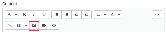
- Insert your image using the image button in the rich text editor.
- Click the image to select it, or double-click it to open image settings.
- Enable the wrap option such as Wrap text around image or a similar alignment setting.
- Resize the image so the text has enough room to sit beside it.
- Preview on desktop and mobile before publishing.
In my experience, the feature works best when the image is fairly small and the text beside it is part of the same paragraph block. If the image is too wide, or if you break the text into multiple paragraph tags, the layout often stops behaving the way you expect.
Where does Shopify text wrapping work?
Shopify text wrapping works in content fields that use the native rich text editor. The most common places are blog posts, pages, product descriptions, and collection descriptions.
This is important because not every visible area of your storefront is controlled by the same editor. For example, homepage sections added in the theme customiser often use section blocks rather than the classic rich text editor, so the wrap option may not appear there at all.
| Shopify area | Usually supports wrap? | Best option |
|---|---|---|
| Blog post content | Yes | Use the rich text editor wrap setting |
| Standard page content | Yes | Use the rich text editor or a theme section |
| Product description | Usually yes | Use wrap carefully, especially for mobile |
| Collection description | Usually yes | Use wrap for short editorial content only |
| Theme homepage section | No, not usually | Use an image-with-text section in the theme editor |
| Custom landing page | Sometimes | Use a page builder for more control |
If your goal is simply to place text beside an image on an About page or landing page, the Shopify Community often points merchants towards using the theme's built-in Image with text section instead of forcing text wrap inside a paragraph. That is usually good advice because it is more responsive and easier to maintain.
How do I wrap text around an image step by step in the Shopify editor?
The easiest method is to use Shopify's built-in image editing options inside the rich text editor. This is the fastest no-code approach and matches the search intent behind this query.
Here is the exact process I recommend when testing this on a live store or a duplicate theme.
1. Add the image first
Insert the image before you finalise the copy. This makes it easier to judge the final spacing, alignment, and whether the image is too large for a wrapped layout.
Use a sensible image size from the start. A huge image squeezed down in the editor can still create awkward spacing or slow page performance if the original file is oversized.
2. Open the image settings
Click the image in the editor to highlight it, then use the image edit option. On many Shopify editor screens, double-clicking the image opens the settings directly.
This is where you can usually set alignment, dimensions, alt text, and the key option: Wrap text around image.
3. Enable text wrapping
Tick the wrapping option so text flows beside the image. Shopify may label this slightly differently depending on the editor version, but the functionality is the same.
Once enabled, the text in the same paragraph flow should sit beside the image rather than underneath it.
4. Resize and align the image
Text wrapping works best when the image is not too wide. A smaller image aligned left or right usually gives the cleanest result.
In practice, I find wrapped images are most reliable when they take up roughly 25% to 40% of the content width on desktop. Larger than that, and the text column becomes cramped and harder to read.
5. Add spacing if needed
Wrapped text looks better when there is breathing room between the image and the copy. If the editor allows borders or spacing, use them lightly.
If not, you may need a small HTML tweak or simply resize the image a touch smaller to create visual space.
Why is my Shopify text wrapping not working properly?
The most common reason Shopify text wrapping fails is that the content is split into multiple paragraph blocks. The built-in wrap feature usually behaves best with one continuous paragraph, not several separate paragraphs.
I have also seen issues caused by oversized images, pasted formatting from Word or Google Docs, and theme CSS that overrides default editor styles.
- The image is too large - reduce its width so text has room to sit beside it.
- You pressed Enter and created a new paragraph - wrapping may stop at the next paragraph block.
- Your theme styles editor content differently - some themes add spacing or display rules that interfere.
- Mobile layout stacks elements - many themes intentionally remove side-by-side layouts on smaller screens.
- Pasted formatting is messy - clear formatting and rebuild the section cleanly.
If you are editing a product page, it is also worth checking whether your theme outputs product descriptions with custom styling. Some themes heavily restyle .rte content, which can change how floated or wrapped images behave.
How do I wrap text around an image across multiple paragraphs?
Shopify does not handle multi-paragraph text wrapping especially well in the standard editor. If you need text to keep flowing around the same image across several paragraphs, you usually need to edit the HTML or use a section-based layout instead.
This is where many quick tutorials stop, but it is the part that actually matters for real stores. Merchants often think the feature is broken, when in reality the editor is just limited.
The original workaround still applies: you can use the Show HTML button in the rich text editor and manually adjust the content. Some merchants use <br> line breaks instead of creating new paragraph tags, which can keep the text visually flowing beside the image for longer.
That said, I only recommend this if you are comfortable editing HTML. It can become fiddly very quickly, especially if someone else later edits the same content in the visual editor and accidentally breaks the layout.
- Open the content in Shopify admin.
- Click Show HTML in the rich text editor.
- Locate the image markup and surrounding text.
- Replace separate paragraphs with controlled line breaks where appropriate.
- Save and preview carefully on desktop and mobile.
Important: this approach is not ideal for long-term maintenance. If the page will be edited often by a client, team member, or content manager, a theme section or page builder is usually the safer choice.
What is the best alternative to text wrapping in Shopify?
The best alternative is usually a two-column image-with-text layout. It gives you better control, cleaner responsive behaviour, and fewer editor quirks than traditional wrapped text.
In my experience building Shopify apps and reviewing hundreds of storefronts, merchants often ask for text wrapping when what they really want is simply text beside an image. Those are not always the same thing. A proper two-column layout is often the better answer.
Use your theme's image-with-text section
If your theme includes an Image with text section, start there. This is the easiest no-code method and usually performs better on mobile because the theme handles stacking automatically.
It is especially useful for About pages, collection intros, and homepage storytelling sections where you want a polished layout without touching HTML.
Use custom liquid or a custom section
If you need more control, a custom section is often the cleanest technical solution. This lets you define the image, text, spacing, and mobile stacking behaviour exactly how you want.
For merchants already making layout changes, this can be a better route than forcing a blog-style text wrap into a product description. If you are already improving product page layouts, you might also want to read our guide on creating a Complete the Look section in Shopify or our post on displaying product accessories effectively.
Use a page builder app
If you want drag-and-drop control without custom coding, a page builder can help. This is usually best for merchants creating landing pages, custom product storytelling sections, or content-heavy pages.
| Option | Best for | Pros | Cons |
|---|---|---|---|
| Rich text wrap | Quick edits in blog posts and descriptions | Fast, built in, no extra app | Limited control, weak for multi-paragraph layouts |
| Theme image-with-text section | About pages, homepage sections, cleaner design | Responsive, easy to maintain | Less flexible inside product descriptions |
| Custom section or Liquid | Tailored layouts | Most control, best long-term structure | Requires development work |
| Page builder app | Landing pages and advanced content layouts | Visual control, reusable layouts | Can add cost and complexity |
Which Shopify page builders are worth considering?
The most well-known options for this use case are PageFly, GemPages, and EComposer. These apps are useful if you need more than a basic wrapped image and want proper layout blocks instead.
I would not install a page builder just to wrap one image in one blog post. But if you are already building landing pages, custom product pages, or story-driven collection pages, they can be worth it.
| App | Use case | App link |
|---|---|---|
 PageFly |
Best for flexible landing pages and custom content sections | View PageFly |
 GemPages |
Best for visual page building with conversion-focused layouts | View GemPages |
 EComposer |
Best for merchants who want drag-and-drop speed | View EComposer |
For stores working on richer visual merchandising, you may also find our guides on adding a Shop the Look section to Shopify and adding an image slider to products in Shopify useful. These often solve the same design problem in a more conversion-focused way.
Does wrapped text work well on mobile devices?
No, not always. On mobile, many Shopify themes force images to display full width or stack above the text, which means the wrapped desktop layout often disappears.
This is one of the biggest limitations and one of the main reasons I rarely recommend relying on wrapped text for important content. A layout that looks polished on a laptop can become awkward or entirely different on a phone.
Given that many Shopify stores now get the majority of their traffic from mobile, this matters a lot. If the content is commercially important, such as a key product explanation or collection intro, I would usually choose a responsive section layout over classic text wrapping.
- Always preview on mobile before publishing.
- Keep wrapped images small and non-essential.
- Use short adjacent copy instead of long text blocks.
- Switch to a two-column section if mobile presentation matters.
What image size is best for wrapping text in Shopify?
The best image size is one that leaves enough horizontal space for readable text. For most content areas, a moderately small portrait or square image works better than a large landscape image.
There is no perfect universal size because themes vary, but the principle is consistent: the image should support the copy, not squeeze it.
As a practical rule, I suggest:
- Use compressed images for faster loading.
- Avoid very wide banners for wrapped text.
- Stick to clear focal points so the image still reads well at smaller sizes.
- Check alignment after resizing because text flow can change quickly.
If image consistency is part of the problem, our guide on making images the same size on your Shopify store can help clean up layouts across the site.
Should I use wrapped text on product and collection pages?
Sometimes, but sparingly. Wrapped text can work for short supporting content, but it is usually not the best format for high-converting product or collection pages.
On product pages, readability and purchase flow matter more than editorial styling. If the wrapped layout pushes key content around or feels cramped on mobile, it can hurt the user experience more than it helps.
For product descriptions, I usually recommend keeping the main copy clean and scannable, then using structured sections for extra storytelling. If you are editing product page content, these related guides may also help: how to display product tags on Shopify and how to remove the vendor name from product pages in Shopify.
What is my recommended approach in 2026?
My recommendation in 2026 is straightforward: use Shopify's built-in wrap option for quick, simple desktop-friendly edits, but use theme sections or page builders for anything important, long-form, or mobile-sensitive.
That recommendation comes from seeing how real merchants maintain stores over time. The more a layout depends on fragile editor behaviour, the more likely it is to break during future edits.
Here is how I would choose:
- For a quick blog or page edit - use the native wrap option.
- For multiple paragraphs - avoid forcing it unless you are comfortable with HTML.
- For About pages and storytelling sections - use an image-with-text section.
- For custom landing pages - consider PageFly, GemPages, or EComposer.
- For mobile-first stores - prioritise responsive section layouts over wrapped text.
Final thoughts on wrapping text next to a picture in Shopify
Yes, Shopify can wrap text around an image, and for short content blocks it works perfectly well. But it is not a magic layout tool, and the limitations become obvious as soon as you add multiple paragraphs, larger images, or mobile traffic into the mix.
In my experience, the best result comes from matching the method to the job. Use the editor wrap setting when you need a fast fix, and use a proper section-based layout when presentation, responsiveness, and maintainability actually matter.
For official guidance on editor behaviour, Shopify's documentation on the rich text editor is worth bookmarking. It is also useful to review Shopify Community discussions like this thread on aligning text next to an image, because they often reflect the exact real-world issues merchants run into.