

Making images the same size on your Shopify store is usually best done in one of three ways: theme settings, custom CSS, or a batch image resize app. The right option depends on whether you want to change how images display on the storefront or actually resize the original image files.
In my experience building Shopify apps and working with merchants on theme issues, this is one of the most common visual problems on collection pages and product grids. A store can have great branding, solid products, and decent traffic, but if product cards jump around because every image has a different aspect ratio, the whole storefront looks unfinished.
The good news is that this is normally a straightforward fix. For most stores, you do not need a developer, and you do not need to re-upload every image manually.
Why do Shopify product images end up different sizes?
Shopify product images look mismatched when the original files use different aspect ratios or your theme is set to adapt to image. That means a square image, a portrait image, and a landscape image will all render differently unless you force consistency.
This happens a lot when merchants source images from different suppliers, photographers, or marketplaces. One product might be uploaded at 2000 x 2000 px, another at 1600 x 2400 px, and another as a wide lifestyle shot. Shopify handles image delivery well through its CDN, but it cannot magically make inconsistent source images look uniform without theme rules or editing.
There is also a difference between image size and image display size. Your original file can stay large and high quality, while your theme uses CSS or settings to crop and present all product cards in a matching frame.
What is the best way to make images the same size on Shopify?
The best way is usually to set a consistent aspect ratio in your theme customiser first. If your theme does not offer that, use custom CSS. Use an app only when you need to bulk edit the source files themselves.
That distinction matters. If your issue is only on collection pages, featured product sections, or product cards, a display-level fix is often faster and safer. If your actual uploaded files are messy, too small, or wildly inconsistent, then a batch editing app is the better long-term solution.
Here is how I would prioritise it for most stores:
| Method | Best for | Difficulty | Changes original files? | My verdict |
|---|---|---|---|---|
| Theme settings | Dawn and newer themes with image ratio controls | Easy | No | Best first step for most stores |
| Custom CSS | Older themes or stores needing more control | Medium | No | Best no-app fallback |
| Image resize app | Large catalogues with inconsistent source images | Easy to medium | Usually yes | Best for bulk fixes at scale |
| Manual editing | Small catalogues or premium product photography | Medium to high | Yes | Best if image quality is mission-critical |
How do I make Shopify images the same size using theme settings?
If your theme supports it, the easiest fix is to set your product cards to Square or Portrait instead of Adapt to image. This creates uniform product image containers across collections and featured sections.
On newer Shopify themes such as Dawn, this option is often already built in. I always recommend checking this before installing an app or editing code, because it solves the problem in a couple of clicks.
- Go to Online Store > Themes.
- Click Customize on your live theme.
- Open a section that shows product cards, such as Collection template, Featured collection, or Product grid.
- Look for settings like Image ratio, Media fit, or Card style.
- Change the image ratio from Adapt to image to Square or Portrait.
- Save and test on desktop and mobile.
This method is ideal if your images are reasonably good already but just look uneven in the layout. It is also safer than editing theme code if you are not comfortable touching CSS.
If you are working on product media more broadly, you may also want to read our guides on adding an image slider to products in Shopify and hiding variant images from the product page in Shopify, because both can affect how image consistency feels to shoppers.
How do I make images the same size with custom CSS?
Custom CSS is the most common no-app method for making Shopify images appear the same size. It forces a consistent image container height or aspect ratio, even when the original images differ.
This is often the quickest route on custom themes or older themes where the customiser does not expose image ratio settings. In my experience, it is also the method most often recommended in Shopify Community threads because it works across many storefronts with only minor selector changes.
What CSS should I use to force equal image sizes?
A simple fixed-height container works on many themes. You may need to adjust the class names to match your theme.
Add one of the following snippets to the bottom of your theme stylesheet, such as base.css, theme.css, theme.scss.liquid, or a similar file.
.grid-product__image-mask {
  height: 220px;
  overflow: hidden;
}
Or, on some themes:
.grid-product__image-mask .image-wrap {
  height: 220px !important;
}
If your theme uses different classes, inspect the product card image container in your browser and target that instead. The exact selector varies a lot between premium themes.
How do I add the CSS in Shopify?
You can add CSS from the theme editor or by editing your code files directly. Always duplicate your theme first so you can roll back if needed.
- Go to Online Store > Themes.
- Click the three dots, then Duplicate your live theme.
- Open Edit code on the duplicate.
- Find your main stylesheet in Assets.
- Paste the CSS at the bottom.
- Save and preview.
- If it looks right, publish the duplicate theme.
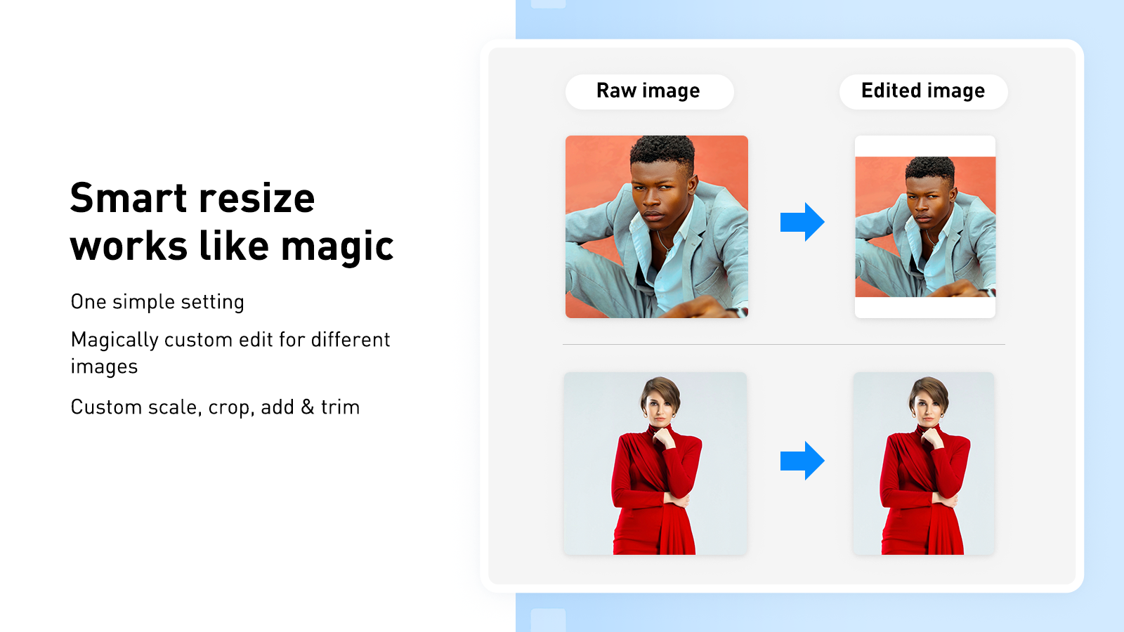
If nothing changes, your selector is probably wrong. That is normal. Shopify themes all structure media slightly differently, so you may need to inspect the element or ask your theme developer for the correct class.
Should I crop, contain, or force a square ratio?
The best option depends on your catalogue. Square ratios are usually best for general ecommerce, portrait ratios suit fashion, and contain is safest when you cannot afford cropped edges.
There is no universal perfect ratio. I usually recommend merchants choose one format and stick to it across the whole catalogue, because consistency matters more than chasing a theoretically ideal size.
| Approach | How it works | Pros | Cons |
|---|---|---|---|
| Crop to square | Every image fills a 1:1 frame | Cleanest grid layout, common for most stores | May cut off edges of tall or wide images |
| Portrait ratio | Uses a taller frame such as 4:5 | Great for apparel and model shots | Can make some products appear smaller in the grid |
| Contain / fit | Keeps whole image visible inside a frame | No cropping | Can create white space and inconsistent visual weight |
For most Shopify stores, 1000 x 1000 px to 2048 x 2048 px square images are a sensible target. Shopify generally recommends high-quality images, and zoom functionality works better when your source file is large enough.
How do I resize all Shopify product images at once?
If you need to resize the actual image files in bulk, use a Shopify app. This is the best option when you have a large catalogue, inconsistent supplier photos, or images that are too small, too large, or poorly cropped.
This is different from CSS. CSS only changes how the image appears on the page. A bulk editing app can resize, crop, pad, compress, and sometimes optimise filenames or alt text as part of the workflow.
These are the apps most relevant to this job from the data you provided:
| App | Best for | App link |
|---|---|---|
| VF Image Resizer+ | Batch resizing and image editing workflows | View app |
| Pixc Photo Resize | Quickly making product images uniform | View app |
| Image Resizer by Shopify | Simple resizing via Shopify's app listing | View app |


My advice is to test any batch image app on 10 to 20 products first. That gives you a chance to check crop behaviour, padding, and quality before processing your full catalogue.
You can also use Shopify's free image resizer tool for one-off assets, social images, or quick prep work before upload.

How do I manually resize Shopify images for the best quality?
Manual resizing is best when image quality is a major sales lever and you want precise control over framing, background, and composition. It takes longer, but it usually produces the best-looking catalogue.
For premium DTC brands, jewellery stores, beauty products, and fashion, I often find manual preparation still beats automation. Apps are great for speed, but they cannot always decide what should stay in frame and what should be cropped out.
- Choose a consistent target size, such as 1200 x 1200 px or 1600 x 1600 px.
- Open each image in Photoshop, Canva, or GIMP.
- Crop to the same ratio and centre the product consistently.
- Export in a web-friendly format and sensible file size.
- Upload the new files to Shopify.
If you are replacing lots of assets, our guides on how to quickly bulk upload product images to Shopify and how to download all product images from your Shopify store can save a lot of time.
What image size should I use on Shopify in 2026?
A practical Shopify product image size in 2026 is usually 1000 to 2000 pixels wide, with square 1:1 images being the safest default for most catalogues. 2048 x 2048 px is still a strong upper-end target for high-quality product photography.
The important thing is not just the pixel dimensions. You also want consistent aspect ratio, compressed file size, and enough resolution for zoom without slowing the page down.
- Minimum practical size: around 800 x 800 px for decent display and zoom support
- Recommended general range: 1000 x 1000 px to 2000 x 2000 px
- Best default aspect ratio: 1:1 square for most stores
- Best for fashion: portrait ratios can work better for model imagery
Large files are not always better. If your store is image-heavy, performance can suffer quickly, especially on mobile. If speed is a concern, read our guide on how to speed up your Shopify theme because oversized media is one of the easiest performance wins.
Why are my pictures still different sizes after resizing?
If your pictures still look different, the issue is usually the theme layout, not the image files. A theme can display equal-sized files unevenly if card settings, CSS, object-fit rules, or section-specific styles are conflicting.
This catches a lot of merchants out. They spend hours resizing images, then wonder why one collection still looks messy. The reason is often that the homepage featured collection, search results, and product page gallery all use different templates or CSS rules.
Check these common causes:
- Your theme is set to Adapt to image instead of Square or Portrait
- Different sections use different card components
- Custom CSS from an app or developer is overriding defaults
- Images have different background padding, making products appear visually smaller or larger
- Variant images are mixed with lifestyle images in the same gallery
In those cases, inspect the section on the front end and compare the wrappers around each image. If the wrappers differ, you need a display fix, not another round of file editing.
Do equal image sizes actually help conversion?
Yes, consistent product imagery can improve perceived quality, trust, and usability. Shoppers are more likely to browse comfortably when product cards align neatly and the catalogue feels professionally merchandised.
The exact uplift varies by niche, but the broader principle is well established: better product presentation tends to support stronger conversion. In practical terms, I have seen stores look instantly more trustworthy after nothing more than standardising image ratios and cleaning up inconsistent backgrounds.
It also improves scanning behaviour. On collection pages, users compare products quickly. If every card jumps to a different height, prices and titles shift around, and that creates friction. Small bits of friction add up.
There is also a speed angle. If your images are oversized and unoptimised, they can hurt load time and Core Web Vitals. That has UX and SEO implications, especially on mobile traffic, which is where many Shopify stores get the majority of visits.
What is my recommended workflow for most Shopify stores?
For most merchants, the best workflow is to standardise future uploads, fix display settings first, and only then batch-edit old images if needed. This gives you the fastest improvement with the least risk.
Here is the process I usually recommend:
- Pick one ratio for your catalogue, usually square.
- Set your theme to Square or Portrait instead of Adapt to image.
- Test collection pages, homepage sections, and product galleries.
- Add CSS only if the theme setting is missing or inconsistent.
- Batch resize old images with an app if the source files are poor.
- Create an upload standard for all future product photography.
This matters because many stores fix the symptom but not the process. Two months later, the catalogue is messy again because new products were uploaded in random dimensions. A simple SOP for image prep prevents that.
Which method should you choose?
If you want the quickest answer, use theme settings first, then CSS, then an app if your source files need bulk work. That order is usually the fastest, cheapest, and least disruptive.
My practical recommendation looks like this:
- Use theme settings if you are on Dawn or a modern OS 2.0 theme
- Use CSS if your theme lacks ratio controls or needs a section-specific fix
- Use an app if you have hundreds of inconsistent supplier images
- Resize manually if product imagery is central to your brand positioning
If you are touching image presentation anyway, it is also worth reviewing related merchandising features such as how to add a shop the look section to your Shopify store or how to create a complete the look section in Shopify. Clean, consistent product imagery makes those sections perform much better.
Ultimately, making images the same size on your Shopify store is not just a cosmetic tweak. It is one of those small fixes that improves store polish, user experience, and often conversion rate all at once.