Last Updated on by Dan S
Originally Published April 27, 2017.
In this guide (updated for 2023), we are going to cover a wide variety of methods on how you can optimize your e-commerce store to maximize conversions. This is known as Conversion Rate Optimization or “CRO”.
Table of Contents
ToggleWhat is a Conversion Rate or CRO?
A conversion rate, usually expressed as a percentage, is the success rate of 1 action vs the frequency of times that action could have occurred.
Put simply for e-commerce, a conversion rate is how many visitors convert to become customers by purchasing something. If your store received 100 visitors on a given day and 5 go on to purchase from you, your conversion rate is 5%. Whilst it may seem daunting that 95 left without purchasing, this is extremely common in e-commerce due to the way people shop.
In general terms, a successful conversion rate is one that works for you on a cost basis. For some people, their store is profitable with a 1% conversion rate, for others they need a much better rate. The industry average is between 3-5%. Don’t worry if yours is below average, conversion rate is something that all stores should aim to continuously improve.
This is where conversion rate optimisation comes in.
In a nutshell:
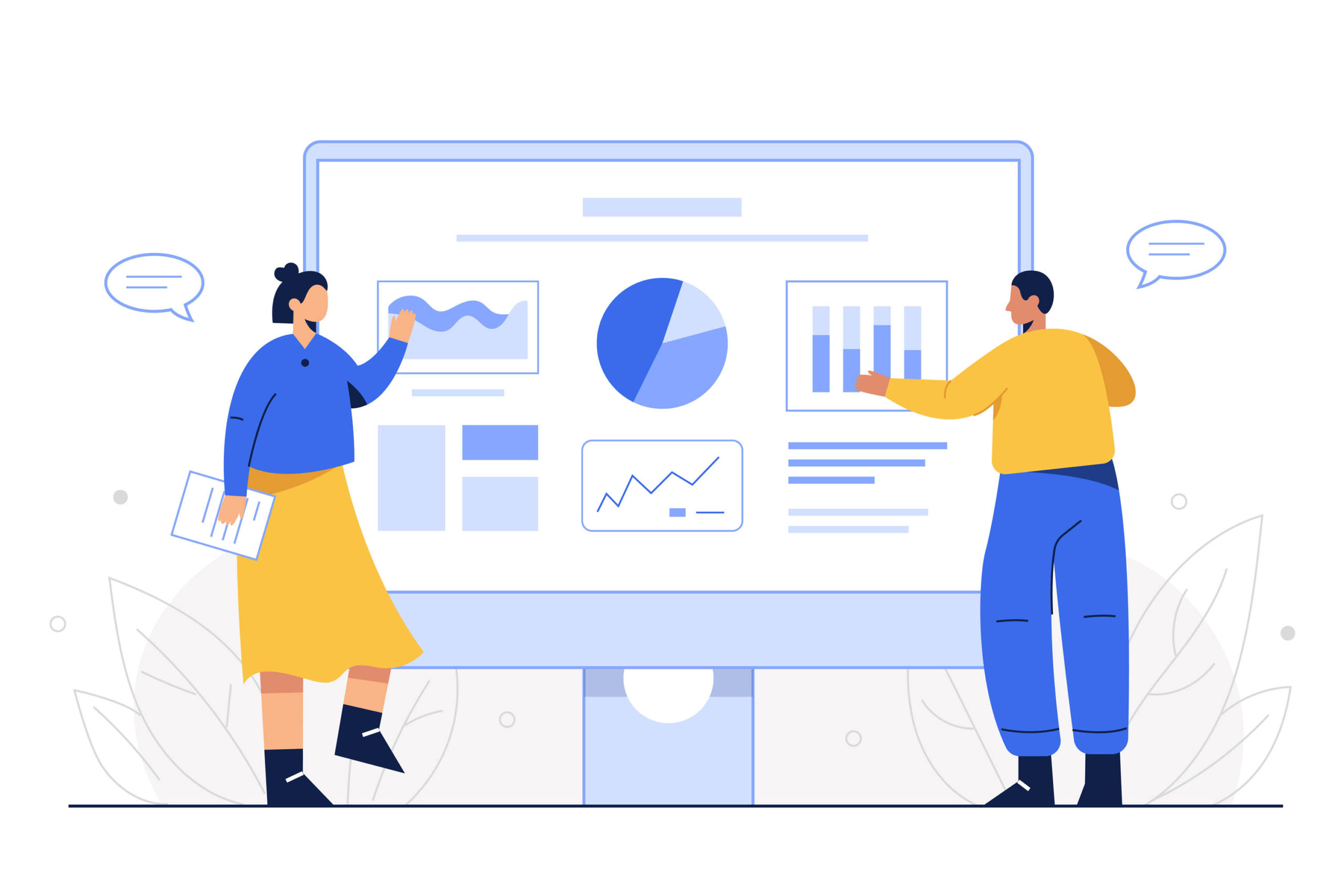
Conversion Rate Optimisation
Conversion Rate Optimisation is a way for increasing the proportion of your stores visitors that makes a purchase, also referred to as a conversion.
Is Conversion Rate Optimization for You?
CRO is an important instrument for Shopify stores, nevertheless it isn’t for everybody depending at what stage your store is at.
In order for you to efficiently optimize your Shopify Store, you first have to have sufficient site traffic to properly conduct a check. If you have just started your Shopify store, you will want to run through our launch checklist to ensure the basics have been covered.
Without a certain amount of visitors, the outcome won’t present any actual perception into how your visitors are utilising your Shopify Store. That will help you decide whether or not CRO is best for you, let’s take a look at its fundamentals. Once your store has received enough traffic, for example 1000 visits, you will have enough data to begin sufficient optimization.
You can still read through this guide as it will help with fine tuning some basic aspects but in terms of A/B testing (where you can compare changes), you will be in the dark. For example, if you change your homepage layout without any data, you may be putting your store to a disadvantage if your previous layout would have converted better.
Another fundamental reason to ensure your store is optimized for conversions is for when you run paid advertising campaigns. Without an optimized store, you could be burning a lot spend on traffic that is getting to your store but then not converting. Ensure you have conversion tracking correctly setup on your store so you can measure results.
A Break Down of Conversion Optimisation On A Page Basis

Homepage
- Select your Slider Images correctly. 9 out of 10 individuals will solely see the primary slide. Don’t assume that individuals will click on the sliders pagination to see the additional sliders. Having it auto-slide can help. Use strong imagery that relates to the product or the lifestyle you are marketing. You can get great images royalty free from places like Pixabay, Burst and Pexels.
- Add a call-to-action for each slider image. On the very least, add a label or some copy that frames the slider appropriately. This will give them purpose.
- Have a main point of focus for your homepage. Above the fold, there could also be too many issues competing for consideration — is it awards? Is it authority indicators (“100,000 customers”, “Largest Product Range”, and so forth) or is it the products you offer? If you’d like to enhance conversions from your homepage, typically eradicating these issues is a good place to start out.
- Spell out free delivery in the event you provide it. If you happen to not provide free delivery, give it a go.
- Make life-style images related to your buyers. Is this how your clients see themselves? Take into consideration their utilisation, not just standard product images.
- Ensure that navigation elements are simply understood. Just remember to use acceptable language and labelling so all potential customers can understand it.
- Embrace press logos. If you get quoted or featured within the media, display it! These make excellent authority indicators.
- Optimise your email calls-to-action. Ensure you’re using sensible copy in your email type on the bottom of the web page, don’t simply use “Sign up to our newsletter” — inform them why and what they’ll obtain by subscribing.
- Make hyperlinks appear to be hyperlinks. Typically hyperlinks are styled like regular textual content, so the customer wouldn’t know to click on them.
- Social Proof. Having an Instagram feed or a tiktok reel of real customers using your products is a strong visual selling point. It shows validation for your product and has the same affect as a positive review.
Cart/Basket Page
- Determine one main call-to-action. “Update Cart” and “Check Out” have the same visible weight; ideally, “Check Out” ought to stand out greater than “Update Cart.”
- Think about eradicating the “Special Instructions” field. It’s unclear what motion you need the shopper to take right here and whether or not it’s a crucial step. What worth does this add to the cehckout?
- Scale back the variety of logos across the Checkout button. Consumers could discover the bank card choices distracting. If you happen to insist on having them there, contemplate placing them in grayscale to push them back.
- Leverage for last minute sales. You know the chewing gum or sweets you see near the checkout in a supermarket? This is a powerful cart upsell for a last chance effort to sell you something. These items are low in price point as well as appealing to everyone so they make for a great sales opportunity.
Checkout Page
- Style Page. Unfortunately the options are limited here if you are on any of the shopify plans excluding the plus plan. What you can do is make sure you have styled it as much as possible by adding a logo, any imagery you are allowed to, change the colours so its on brand.
- Upgrade your plan. If you are doing enough business then owning the checkout stage is worthy investment. The Shopify plus plan allows you to hose your own checkout page giving you complete control over the design and functionality of it.
Product Pages
- Think about grouping similar products into variations. For instance, if you offer a product in six completely different colours and three completely different sizes. As opposed to listing 18 completely different products, list one product with all the variations.
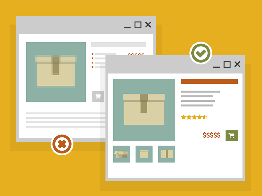
- Use informative & descriptive titles. Don’t just say “Large Red T-Shirt”, use this element to improve your product and set you apart. For example, it could be a slim fit Red T-Shirt so a title like “Muscle Fit T-Shirt in Ripping Red” gives the product some life.
- Don’t depend on tabs to show information. Assume that less than half of your visitors will click on these tabs, so don’t put essential info in them. Instead, try to make all elements that will help sell your products clearly visible on the product page. Don’t eradicate tabs but don’t rely on them!
- Add lifestyle pictures. Put simple white background product pictures as the lead. If your product is lifestyle orientated, e.g sunglasses, then adding shots of them in use on a model on location can really help sell the product.
- Use Video where possible. Embedding Videos can be a great way to help sell your product. Customers tend to relate better to suitable product videos as opposed to static imagery.
- Take away redundant choices. Some themes will show product choices when just one possibility is available; if doable, take away the redundant choices. Lowering friction and the variety of clicks is all the time a dependable technique to improve conversions.
- Present delivery/shipping and return info. Be upfront about it. It can be a real deterrent for potential buyers if you don’t have a clear shipping policy. Potential customers want to know when they might expect to receive their order. You can easily a achieve this with a Delivery Timer.
- Add narrative to your product copy. Typically product particulars are displayed in a really stark, “scientific” method — merely stating details and figures in regards to the product. There’s an enormous alternative right here to inform a narrative and actually give some emotion to the merchandise. Promote the benefits.
- Reduce the “left digit” by one to create a sense of value to the customer. For example, a price of $10.00 becomes $9.99 or a step further, $9.95. Why is the left digit so important? Because it anchors the perceived magnitude. Our brains encode numbers so quickly (and beyond consciousness) that we encode the size of a number before we finish reading it.
- Check the size of the Price on the Shopify product page compared to other elements. Customers perceive your price to be smaller if you display your price in a smaller font size. It’s a mind based theory using psychological tactics similar to colour theory. If not an option in your theme, use CSS.
- Sizing charts. This applies to any products where you are asking the visitor to select a size. You can add these via HTML tables if you know how, through tabs if your theme supports it or through an app.
Collection Pages
- Grid Style. When possible, use a grid. It puts more choice in front of the customer for comparison. Customers like to browse. Scrolling down a list can be quite dull. With a grid, your customers eyes can move freely across choice which eases the brain power required to shop. For mobile, 2 columns can help but it isn’t so important as mobile users are used to scrolling.
- Filterable Options. Another aspect is making sure your collections are filterable for convenience. For example, offering price breakpoints, sizes, colours and manufacturer filters allow your visitors to narrow down their search.
Further Elements for Conversion Rate Optimisation
Shipping/Delivery Charges. Charging for Shipping/Delivery should be avoided for standard options
Sales/Offers. Make it obvious for visitors who are after a deal. Putting these deals into an easy to find section will help them find it quickly before they leave your site.
Improved Search/Filters. If a customer can’t find what they are looking for then it can cause aggravation and ultimately no sale. Whilst the native Shopify search is good, there are companies who provide better search options for your store.
A popular App is Searchanise.
It requires a small subscription for store of a certain size but it can greatly improve the customer experience.
Abandoned Carts
If a user makes it to the cart but fails to checkout, then you have what is called an abandoned cart. The most common reasons are:
- Shipping/Delivery – Visitors may have gone to the cart to calculate shipping out of curiosity or were put off by it. Try to offer a free delivery method to reduce the chances of this.
- Security – Even though shopify is a secure checkout, your visitor may not be aware, make it obvious in the cart
- Unanswered Customer Queries – Make sure the customer has all the information they need to complete a checkout (Returns Policy, Payment Methods, Delivery times) – Live Chat can assist with this greatly
- Follow Up – Get those Abandoned Cart emails automated. The average store can capture 7-10% of abandoned carts by sending an email reminder/follow up to the customer.
For an in-depth and thorough guide to abandoned carts for Shopify, check out this guide.
Offer Multiple Payment Methods
The majority of frequent online shoppers will have a PayPal account and a debit/credit card handy to use.
Offering both PayPal and a secure card gateway such as Shopify Payments/Stripe will keep you covered in most circumstances. Also, do some research on popular payment gateways for your country.
Clarity
Make it obvious. Have a nice “Add to Cart” Button. Easy search form, obvious customer information, contact details etc. If you don’t make it easy for the customer, they may just click the back button.
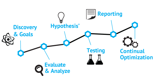
Final thoughts.
Usability testing is your greatest friend when it comes to optimization. We strongly advocate conducting consumer testing on your Shopify store to seek out issues along with your UX which you may not pick up on.
Give individuals some tasks (e.g. discover X, and purchase it), and have them speak out loud whilst they’re shopping on your store. You both watch over their shoulder or watch a recording of it.
Whilst not everyone can get someone to do this, another option is session recording and playback. You can install apps on your Shopify store such as Hotjar and Lucky Orange which allow you to record real sessions and play them back.
This is great for watching unbiased navigation on your store, identifying bottlenecks, finding navigation issues and more. Playing back just a few of these will give you a great insight into how customers actually use your store.
The more data you can gather of how people actually use your website, the more you can improve it.
Remember, its your customers who need to check out, not you!


